


This post is going to show you exactly how to create a mobile style menu on your Showit website!
You may have noticed a fun trend where websites have a pop out menu for their desktop website. Similar to a mobile menu where you would click on the little hamburger icon and the menu pops up.
Prefer to watch?
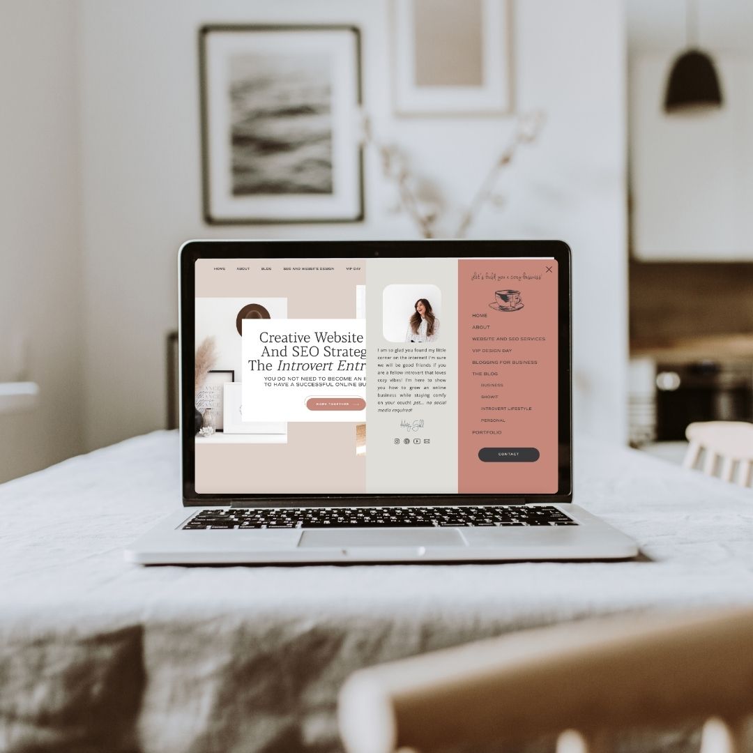
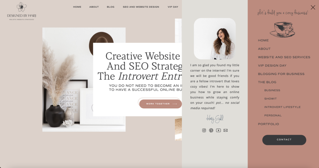
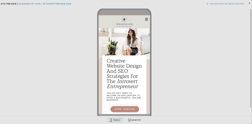
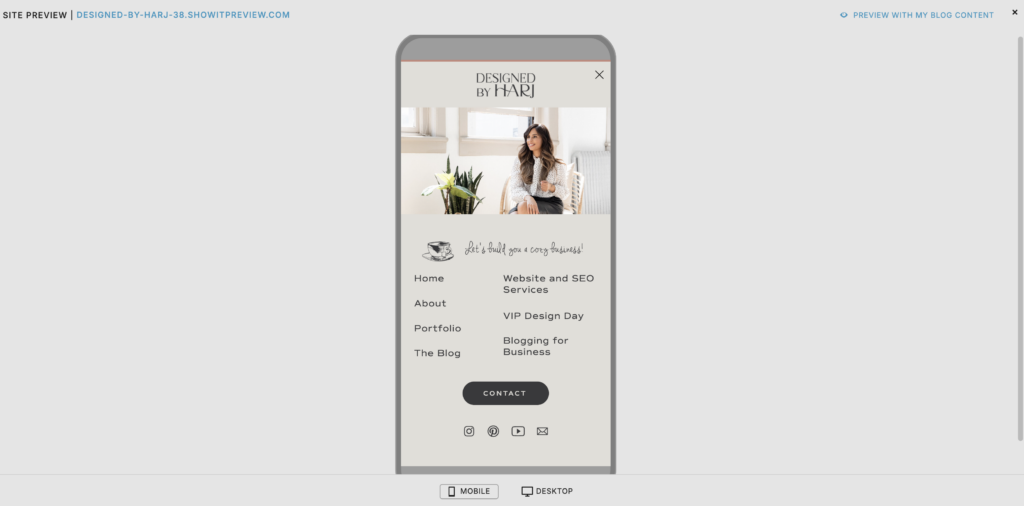
You can see exactly what I’m referring to in the screenshots from my website below!
Desktop Menu
Closed

Open
Mobile Menu
Closed
Open
You can see on my website I still have a top navigation menu that includes the main pages of my website that I want users to visit. But with the pop out menu I have added a few additional links like my Blog categories. This way the main navigation does not get cluttered but your users can still easily find the additional website links!
Another reason I love having these two options is so I don’t have to have a sticky menu with the main navigation links visible at the top. I just have the hamburger icon sticky to top. This way when you scroll down the page only the hamburger icon stays visible in the top right corner.
Nothing against a full sticky to top menu, I just like how clean this looks on my website. But it all depends on design preference and your website strategy!

I have the perfect gift for you!
I created a template of the exact Blog Content Calendar I use to stay organized and consistent with my posting schedule! You can download it for free below!
So let’s get into the nitty gritty and show you how to create your own mobile-style menu on Showit website!
There are going to be 2 parts to creating this style of menu. If you’re familiar with Showit you know that you design separately on Desktop and Mobile. The good thing is you can use the same canvas for both! So we can create one canvas (section) which will be the closed version of the menu. And one canvas which will be the open (pop-out) version of the menu.
First let’s create the closed menu
You can go ahead and add all of the menu links you want visible on your desktop here. Add your logo and a hamburger icon. Design this anyway you like! You can choose to have a colored background for your menu, I chose to have a transparent background here.
After you have added all of the elements on the desktop version, go ahead and design the mobile version. For your closed menu on mobile you don’t want to have very many elements visible so that it doesn’t look messy and cluttered. I would recommend having only your logo and the hamburger icon visible here. The rest of the elements you can “hide” on mobile.
I have added a coloured background on my mobile version. To create a different background style on mobile vs. desktop:
- Click Canvas Background on the right hand side
- Click the two little dots next to Color
- Select Split Mobile & Desktop
Again this is all design and style preference!
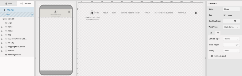
Here are a couple of Canvas settings you should have in place:
You can add these by simply clicking Canvas on the right hand side editing menu.
- You will need a high stacking order so that it shows up above all other canvases. I choose to set mine at 70 which is quite high but it’s my thing I can’t stop!
- On Mobile you can see I have set Sticky to Top on Scroll. Meaning it will always be sticky to the top once they start scrolling.
- You can choose to have your Desktop menu sticky as well. For mine I do not have this menu sticky but again it’s your design preference!
Another thing I want to mention here, which if you are familiar with Showit you will already know. You can see the Logo overlapping on the menu links, this will expand when the website is viewed on desktop!
Now let’s create the pop out version of this menu!
Alright, so this is the expanded version of the menu when the user clicks on the hamburger icon.
I actually like starting this canvas by simply duplicating the Closed Menu we have already created. This way you have the background settings in place and the links added which you can easily copy and paste to add more menu links!
Let’s start by updating some of the Canvas settings for this specific canvas
Mobile & Desktop Canvas Settings:
- High stacking order (higher than your closed menu as this will appear above that canvas)
- Canvas type should be set to Window Height
- Sticky to Top
- Toggle on Hidden to Start
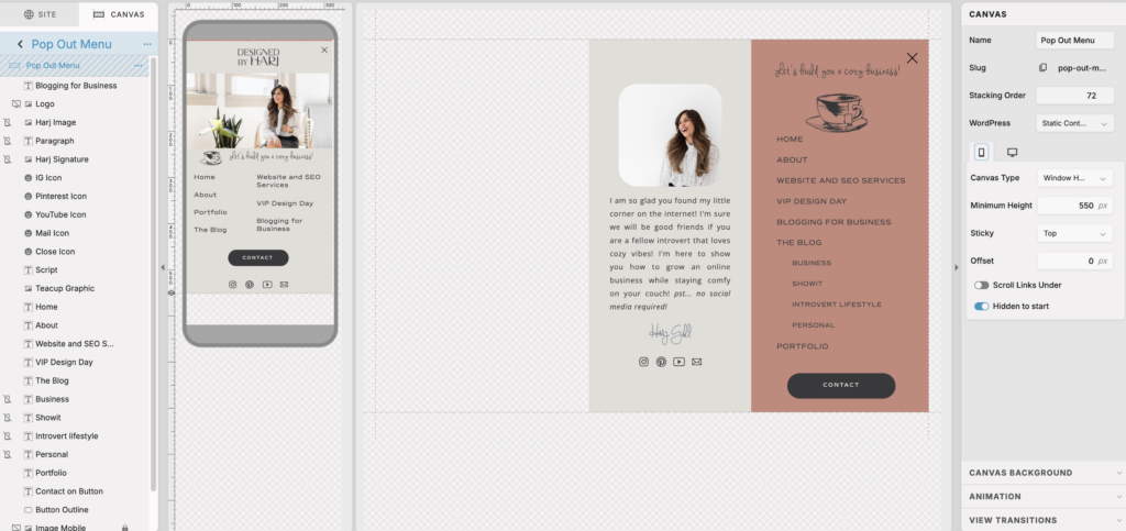
Okay, now to start designing your desktop and mobile pop out menu!
This is when you can showcase all of your links you want visible on mobile and desktop. And remember, you might have some you want to show on one vs. the other. Be sure to utilize the option of hiding elements if needed! You will see I have some elements only showing on desktop and not mobile. Mostly because I don’t want the mobile version to look too crowded!
Pro Tip: Be sure to use the Horizontal and Vertical Lock settings when designing your menu on both desktop and mobile!
Designing the desktop pop out menu on Showit website
So again, starting with the desktop version. I did keep a transparent background for the desktop pop out menu. This is because I wanted the menu to only be covering half of the screen, on the right hand side when opened. You can choose to have it cover the entire thing, only cover the top half of the screen, whatever you’d like!
First things first, I have just added a couple of Rectangle elements as the background colors. Place these where you want them for your design, I have them on the far right from the top of the screen to the bottom. So I have used horizontal and vertical locking here to make sure they are sticking to the far right and covering the screen vertically top to bottom.
Then I added all of my menu links and some images and graphics. Design this canvas to your heart’s desire! Be sure to use the lock settings. In my case, I have locked all elements to the far right!
Swap out your hamburger menu for a close icon.
Designing the mobile pop out menu on Showit website
Go ahead and design your mobile menu now. My mobile menu has a solid background as I want it to cover the entire screen when opened! You can add or hide elements as needed! Be sure to have that close icon in place of the hamburger icon so users can X out of this menu on your live site.
You’ll notice you don’t have horizontal locking settings here but you will have the option to vertically lock.
I always recommend using the preview option in Showit here to see how everything is looking!
Once you’re done designing let’s apply the settings to make this all functional!
Apply menu open and close settings
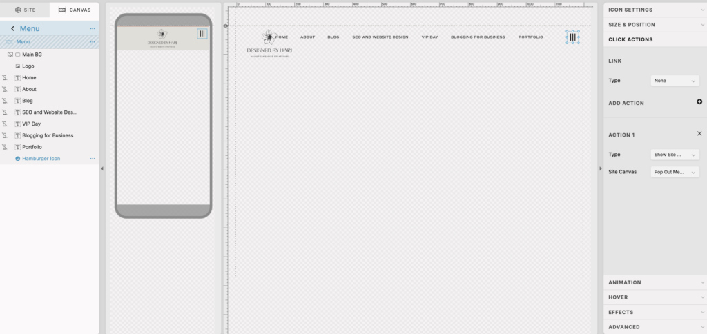
In your closed menu
- Select hamburger icon
- Select click actions
- From action type drop down select Show Site Canvas
- From site canvas drop down select your Pop Out Menu
In your pop out menu
- Select X icon
- Select click actions
- From action type drop down select Hide Site Canvas
- From site canvas drop down select This Site Canvas
And there you have it! Now you know exactly how to add a mobile style menu on your desktop Showit website!

You’ll also love…
How do you create a successful blog for your business in 2025
How to customize URL link and create Showit redirects
What is Organic Traffic in Digital Marketing
Digital Marketing for Introverts: A Guide to SEO, Blogging and Pinterest
