


If you are an OG Showit user; you know the struggle of creating a perfectly aligned button using the text and rectangle elements! If you’re anything like me, you didn’t really think much about this until the new Button feature came out recently. When I finally let myself admit, gosh that was annoying! Not being able to add a button with a click of a button, oh the irony!
But now that we do have this much needed new feature in Showit, the platform is even more intuitive to use – if that was even possible!
In this post I am going to share everything you need to know about the Showit Button feature!
What is a Showit button?
It’s a super easy way to add a default button style to your website. You set it once and are able to quickly and easily add it to your website!
How many button styles can you set with Showit buttons?
You can set 2 different styles within your Design Settings in Showit. A Primary style and a Secondary style. You can add individual hover effects to both as well! From there, you can customize individual buttons (and hover effects) directly on a page! So basically, you have complete design freedom – as you do with anything in Showit!
Can you add hover effects to Showit buttons?
Yes! You can easily add hover effects to your Showit buttons through Design Settings. Again, you can go even further and customize hover effects for individual buttons on any page!
You know you need a website for your business but you have no idea where to start?
Don’t worry, I got you!
Sign up below to download your FREE Website Content Roadmap to get started!
How to create your default button styles in Showit
This is super easy to do, you can set it and forget it!
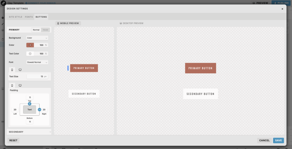
Log in to your Showit Design App and go into your Design Settings. Here you will see a Buttons tab added next to Site Style and Fonts.
Click that Button tab and you will see all of your customization settings!
You are able to set two different button styles:
- Primary Button
- Secondary Button
I recommend setting one as a dark button and the second as a light option. This way you can swap between the two depending on the canvas style. If you want any unique style on a specific canvas you can manually customize it on the page!
Showit button style options
You will see two different style settings for each button (Primary and Secondary)
- Normal – this is what your button will look like when added to your website.
- Hover – this is the hover effect for that specific button style
Main styles and + Customize options
When you click on a specific style to edit, (eg. Primary Normal) you will see the Style Settings appear. If you don’t see a specific style listed, simply select the + Customize option and it will show all of the style options!
Here are all of the style settings available to customize Showit buttons
Showit button style settings:
- Background type
- Color
- Text color
- Font
- Size
- Padding
- Border color
- Border size
- Letter spacing
- Letter case
- Line Height
- Corners
- Drop Shadow
- Opacity
You don’t have to edit every single one of these style options. Apply what you need to for each button style to keep your Showit buttons consistent throughout your website!
You can also remove customizations if you choose to. You can do this by simply clicking on the three dots next to the setting and selecting Remove Customization.
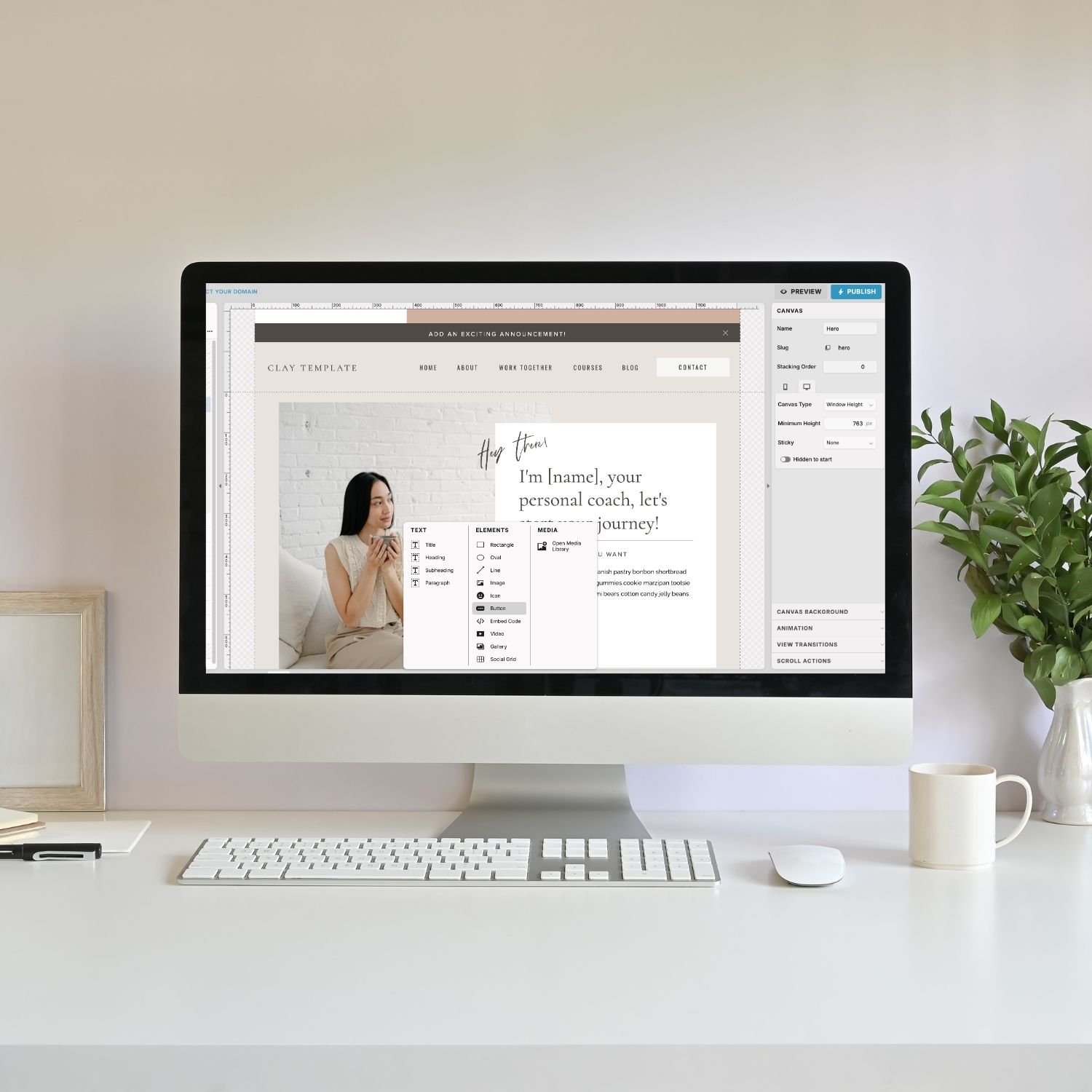
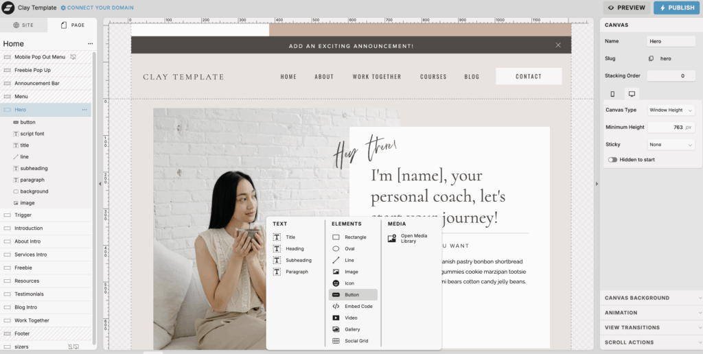
How to add a button to your Showit website page
Oh my gosh, this is so easy now that we have a Button element within Showit! So you’ve already set your style within Design Settings. Now all you have to do is add it to your canvas:
- Go to your canvas where you want to add your button
- Hover over the add element icon on the bottom toolbar
- Select button
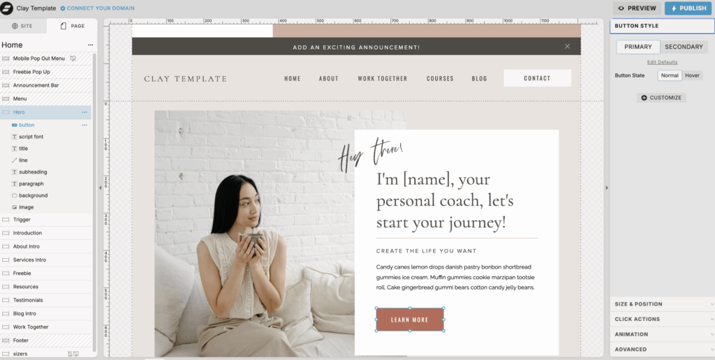
How to customize an individual button on Showit
You can leave the button as it is with your default design settings you’ve already added. Or if you want a unique button style on that specific canvas you can make additional customizations. To do this:
- Add button to your canvas
- Click the button style tab on the right-hand menu
- And then select the + customize option
- You can customize for both the Normal style (how it originally appears) or the Hover effect for that specific button!
How to convert old text and shape combinations to a button on Showit
This is again very easy to do! If you have a site built on Showit from when there was no Button element; you will have a combination of a text and shape element that acted (and appeared) as a button.
Instead of having to delete and replace all of these old buttons; you can easily convert them into a button!
How to convert text and shape into a button on Showit
- Go to where these two elements are on your canvas
- Then hold the Command key (or if you’re using a PC this will be the Control key)
- Then click on the text element and then the shape element
- This will group the items together
- Be sure to only group the text and shape elements together to create a button. This will not work with other elements. And it can only be one shape and one text box, not multiple
- After these elements are grouped together, you’ll see an option at the top of the right hand menu that says “Conver to Button”. Select this to apply your default bottom style that you’ve set in your Design Settings.
You’ll also love…
What I Learned After Designing 10+ Showit Website
How to Link Blog Category On Showit for Better Navigation
How to Use SEO Header Tags Correctly on Your Showit Website
My Quarterly Blog Planning Strategy as a Business Owner
How to Create a Website Content Strategy That Works While You Sleep!
