


In this post I am going to show you exactly how to create a menu bar on Showit for desktop and mobile!
I am going to show you how to create a traditional website menu bar so your website visitors can easily navigate around your website! I do recommend having no more than 5-6 links on your menu bar.
Here are some things to think about when choosing what pages to link on your navigation bar:
- What action do you want your visitors to take?
- What information do they need to easily find in order to work with you/buy from you?
- What information will they be expecting to find on your website?
Typical menu bar links include:
- Home
- About
- Services
- Blog
- Shop
- Contact
- Sign up for Newsletter
You don’t have to have every single one of these but the ones that are most relevant for your business!
Once you have determined what links you want on your navigation bar you can go ahead and start creating it using the following steps!

You know you need a website for your business but you have no idea where to start?
Don’t worry, I got you!
Sign up below to download your FREE Website Content Roadmap to get started!
Follow this step by step guide to build your website menu bar on Showit. We will design both desktop and mobile at the same time!
You will need to create two different canvases
- Will be the menu bar visible on both mobile and desktop at all times
- Pop out menu only on mobile. This is what will appear when user clicks on the hamburger icon to view menu on mobile.
Create your first canvas: desktop and mobile navigation for website
Add and design all elements on a new canvas
I like to view both mobile and desktop while designing. This way I can work back and forth to update them both as I design.
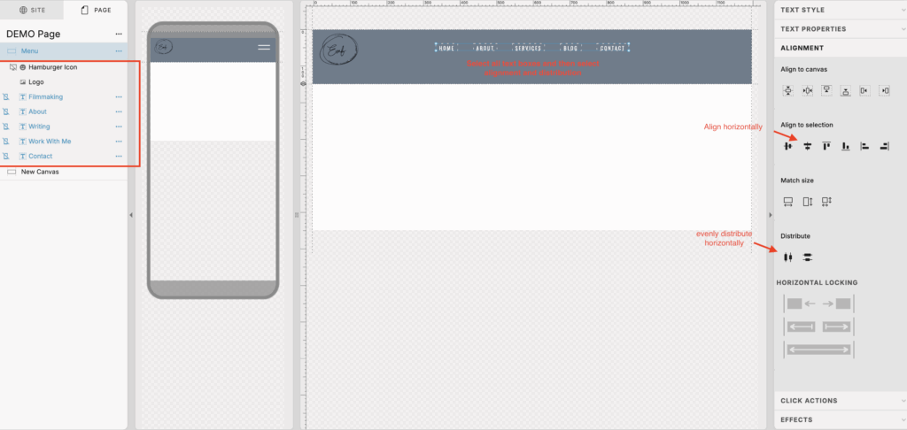
- Add a blank Canvas to your page and select a background color
- Add a text box for your first navigation link and apply your desired design settings. (color, font style, size, etc.)
- When you are happy with your text design, duplicate it for each menu link and rename.
- Be sure to stretch the text boxes so they match the length of each link title.
- Roughly place the menu link text boxes where you want them on your canvas. This could be in the centre so they show up in the middle of the page, side by side. Or you may want them left aligned or right aligned.
- Select all of the text boxes and use the alignment settings on the right to make sure they are all evenly aligned and distributed.
- Add your logo
- Add a hamburger icon
Element visibility
The following elements should be visible ONLY on desktop
- Menu bar links
The following elements should be visible ONLY on mobile
- Hamburger icon
The logo can be visible on both!
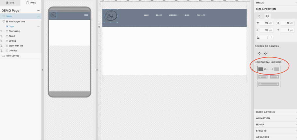
Horizontal Locking
Use horizontal locking if you have specific elements you want to stick to the right or left. This can be your logo if you want it on one side or if you want your navigation links on one side or the other.
You will only need to apply horizontal locking for your desktop design.
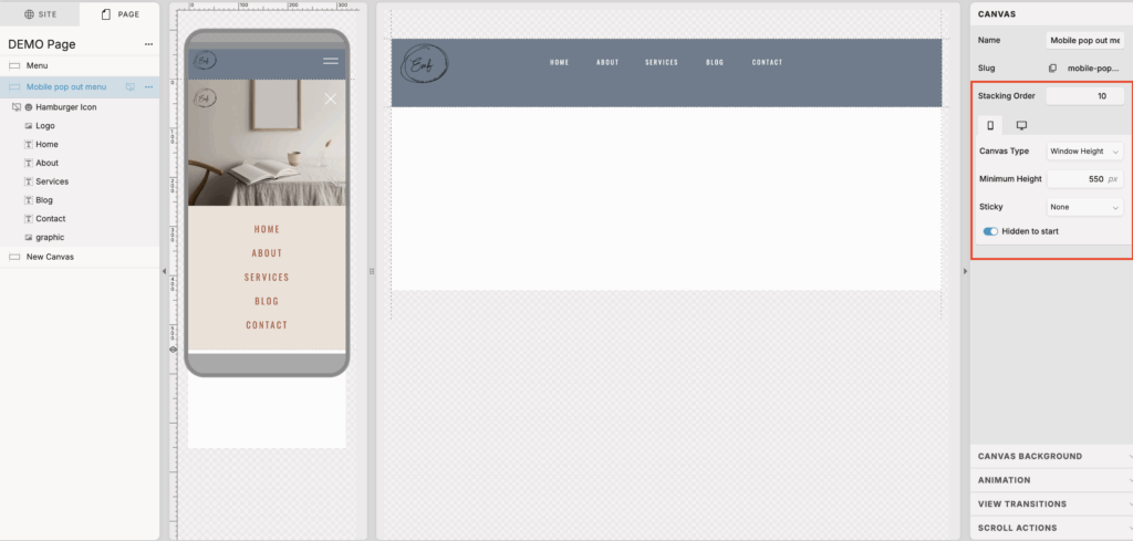
Create your second canvas: mobile pop out menu
Add your pop out canvas
- Duplicate your menu bar canvas that you just created
- Rename canvas – I like to name it mobile pop out menu
- Select the three dots next to the canvas name and toggle off visible on the desktop. We only want this visible on mobile since we do not need a pop out menu on desktop.
- Make this canvas height at least 450 px
- Select Canvas type from the right hand side and select window height. This will ensure when this canvas is opened on mobile it will cover the entire screen, it just looks better aesthetically.
- Select hidden to start. This way this canvas will not be visible unless user clicks on the hamburger icon.
- Make sure this canvas has a high stacking order so it appears above all other canvases when opened.
Since this canvas is window height, you can use vertical locking on elements on this canvas.
Mobile pop out elements
- Swap the hamburger icon to an X
- You can add an image here to fill up some space since this canvas is window height
- I would recommend using your vertical locking options here to lock this to the top of the canvas.
- Make the links visible on mobile now so that we can link out to each page from this pop out menu. Design this so it looks pretty!
- Use your alignment and distribution tools on the right to help you make all the links even
Apply functionality for your menu bar and mobile pop out menu
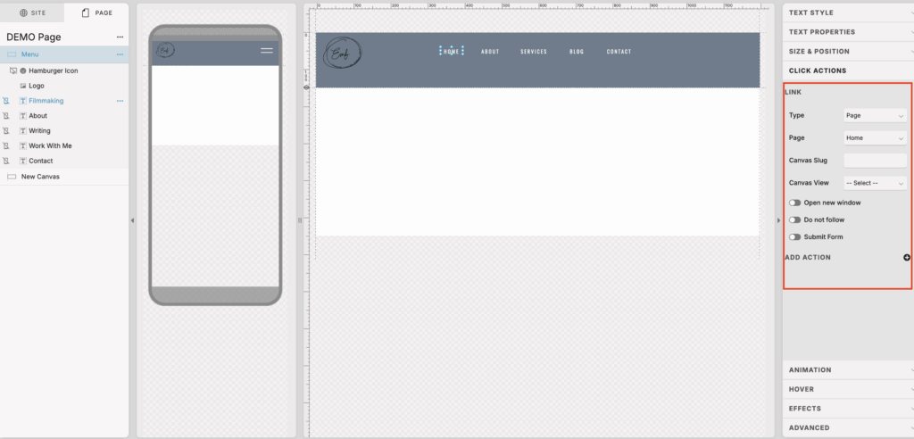
Link your text boxes and logo
- Select the element
- Select click actions on the right
- Select page
- Select the page you want to link out to from the drop down menu
Apply functionality to your hamburger and x icons
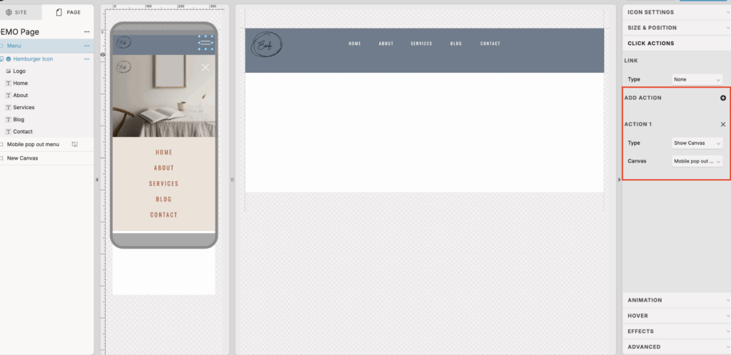
Hamburger icon functionality to show mobile pop out menu
- Select the hamburger icon on mobile design
- Select click actions on the right
- Add an action
- Select show canvas from type drop down
- Select the mobile pop out menu from canvas drop down
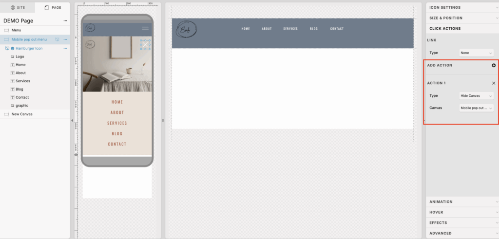
X icon functionality to hide mobile pop out menu
- Select the x icon
- Select click actions on the right
- Add an action
- Select hide canvas from type drop down
- Select the mobile pop out menu from canvas drop down
And there you go! Now you have a functioning menu bar on Showit!
You’ll also love…
How to create a mobile style menu on Showit desktop
Showit: How to add accordion FAQ on website
How to use ClickUp for blogging and content marketing
Everything you need to know about Showit websites for business
How to customize URL link and create Showit redirects
