The website homepage for hairstylists is super important. This is the page website visitors are going to land on when they click on your web address.
We need to capture the visitors’ attention immediately to keep them on your website so we can guide them through your client journey. This is going to help increase your conversion rates because you’re basically holding their hand and leading them to take action.
The very first thing you need to focus on when building a website homepage for hairstylists is the above the fold section.
What the heck is above the fold?
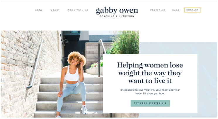
This is the very top of the website homepage for hairstylists. This is what the website visitor see’s before they start to scroll down the page.

Image source
There are a few things in this image above that I want to point out.
- Hero image
- Tagline
- Location
- CTA
The hero image should be an image of YOU!
For every website homepage for hairstylists it’s important that your potential client connects with you. Having an image of you looking directly at the camera is a great way to connect with your visitors!
And make sure your images are high quality! Nothing ruins a beautiful website like low quality, blurry images!
I know iphones are quite evolved but that’s not what we’re looking for here. You need images taken by an actual professional camera.
IPhone images can look great on mobile but when they are stretched on a desktop, they tend to blur out!
Your tagline is going to capture your visitors’ attention even more!
Answer these three questions and put them together into a cute and clever tagline.
- What you specialize in?
- Who your ideal client is?
- How are you going to solve their problem?
When you put this together into a tagline it shouldn’t be more than 2-3 sentences!
Here’s an example:
I specialize in installing high quality hair extensions. After I work my magic your fine hair will transform into your dream mermaid locks!
If I break this down, it looks like this:
- What you specialize in? – Installation of high quality extensions
- Who your ideal client is? – Fine hair clients
- How are you going to solve their problem? – By transforming their hair into full luscious locks!
I can’t express how important it is to stand out on your website homepage for hairstylists.
There is a lot of competition but there are also endless clients. You just need to set yourself apart and this tagline is going to help you do that!
Next, make sure you add your location!
If your visitor can’t find your location right away they are sure to wander to another site. Have your location right under your tagline!
And then your CTA.
CTA is a Call To Action! We want to take every opportunity to have our visitors move along our client journey. If you want them to book an appointment, then have a button right under your location that says “Book an Appointment”.
This is all above the fold, but there more to a website homepage for hairstyilsts.

The homepage is basically an introduction to all other pages on your website!
Share the products you use and link to the shop page.
Not all independent stylists sell products but either way you do have products you use in the salon.
Talk about these products! Why do you use them, how do they help your clients achieve their perfect hair, etc.
It’s so important to have testimonials sprinkled throughout your website!
Hairstyling is a visual service! Provide pictures of work you have done. Again, remember to use high quality images.
Another thing potential clients are looking for when they look you up is your pricing guide!
You don’t have to have all of your prices listed on your homepage. But you should have a link that takes them to your price guide.
We don’t ever want to leave our website visitors searching for what to do next. Or where to find information. We want to answer all of their questions on our website and provide CTA’s throughout to guide them.

Posts you will also love…
Showit Pricing – Which Plan Is Best For You!
