Your website can be your biggest marketing asset!
Make sure you are using it to your advantage
Here are 6 website mistakes you might be making
-
Not including images of yourself
If you are an Online Coach/VA/Social Media Manager you need to connect with your client on a personal level. And to do this your website visitors need to see who you are behind the business.
They are choosing to work with you so show them your face!
And of course, not every picture has to have you in it but definitely on your about page and on the home page include pictures of yourself.
2. Using low quality photos
Honestly, if there’s one thing you take away from this post, please please please let it be this!
Using low quality photos on your website will break it! Not literally, but you know the saying “make it or break it”, this will break it.
Having images on your website that are clear and crisp is key. And let’s not stop there, we also want them to represent your brand and what you do.
So pictures that actually relate to the work you do or attract your ideal clients.
Try using images with colors that match your brand color palette so they look aesthetically pleasing on your website (and social platforms for that matter).
And just to be clear, I’m not encouraging you to go out and book a photoshoot. If you can, that’s wonderful! But if not you can take great pictures on a smart phone and then pair that with some stock photos.
You can purchase free stock photos on sites like Pexels or Unsplash.
3. Not including CTA’s
You know the action you want your client to take but they might not know what that action is.
We have to act as though we are hand holding your client and guiding them to do what you want them to.
Provide CTA’s prompting your client to take action on your website throughout each page.
A good rule of thumb is to make sure you have a CTA on every section of the page. So basically anytime they scroll down the page a new CTA should pop up so they aren’t ever left searching.
You know you need a website for your business but you have no idea where to start?
Don’t worry, I got you!
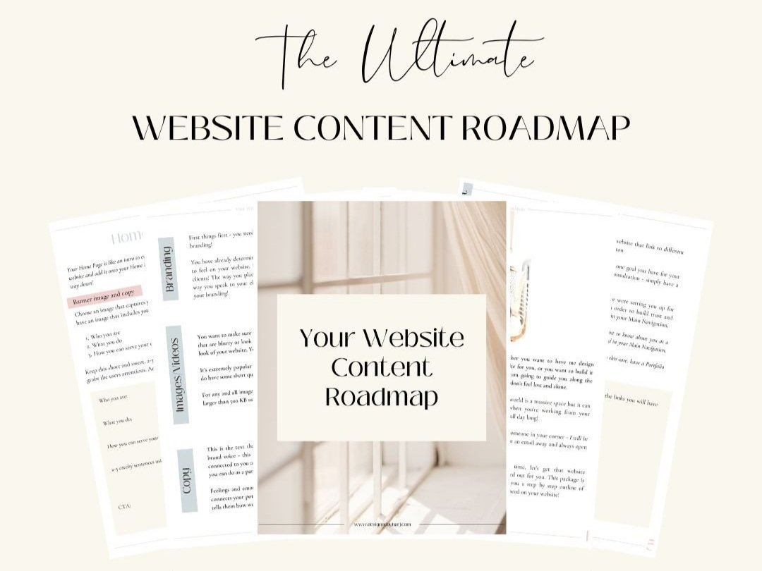
Sign up below to download your FREE Website Content Roadmap to get started!
4. Is it maybe a little messy?
I’m not hating I promise (or judging) but I have seen some websites where there is a lot going on.
This could be with design or with information. Both things should be clear and not overpowering.
I’m not talking about bold designs, bold designs can be beautiful. Not to mention, they’re kind of “in” right now as well. Just make sure that the design is tastefully laid out.
Choose a few colors and design elements and use them in different ways throughout the site. Don’t use too many different fonts, colors that don’t blend together resulting in a miss mash of a design (did I just make up “miss mash”).
And then on the content side of it, you want it to be very clear what you do and who you serve. The last thing any website should do is leave your visitor questioning “what do they do” or “how do I work with them”.
5. Not utilizing your website to grow your email list!
This can be slightly subjective because you may be jussst starting your business and an email list is the last thing on your mind. But I firmly believe it’s never too early to start an email list.
Take this one or leave it, I won’t be offended! It’s good to think about though.
The reason being, if someone finds their way to your website (yay), what if they never return?
You could be the perfect person for them to work with but they might forget about you. But if they land on your site, they get on your email list, you can keep on poppin’ up in there as many times as your little heart desires.
And if you are consistently connecting through email and providing valuable content – guess who they’re going to come to when they are ready to invest?
6. Too much copy (text on your website)
Tell me the truth – when you visit a website do you take the time to read every word? I will take the liberty of answering my own question – no.
If you are writing too much content then your visitor might not take the time to read it all, in turn missing out on valuable content.
Write clever and catchy lines that are attention grabbing.
Utilize different sizing for the copy on your page. Anything that is super important and you know your client with connect with, write it in a larger font size or make it bold. And then the details of that point can be below in smaller text.
So if that larger font grabbed the attention because that particular thing is interesting to them, they will read the small text to get more info.
If not, they will continue scrolling until they come across the next thing that pops out and go from there.
Writing in this way is something to keep in mind when writing your blog posts as well. However, of course on your blog you will be writing longer posts!

You’ll also love…
How To Make A Website For A Small Business
6 Must Haves On Coming Soon Website Landing Page
My Custom Showit Website Design Process


