


I absolutely loved designing this custom life coach website for my client Kat Taniberg!
She has a beautiful business where she supports women and men through spiritual healing and life coaching. She hired me for a Custom Website Design package. With this package I build your entire website from a blank canvas. I also create copy writing guides for your specific business and the services you offer. Of course, there’s always the option to work with a copy writer (I have a great one I work with that I can refer you to). However, a lot of my clients do choose to write their own copy. And for this reason, I do include copy writing guides in my packages to help walk you through exactly what you need to write on each page of your website!
Here are the services she offers as a Life Coach:
- One on one coaching
- Group coaching
- Hypnotherapy
- Courses

You know you need a website for your business but you have no idea where to start?
Don’t worry, I got you!
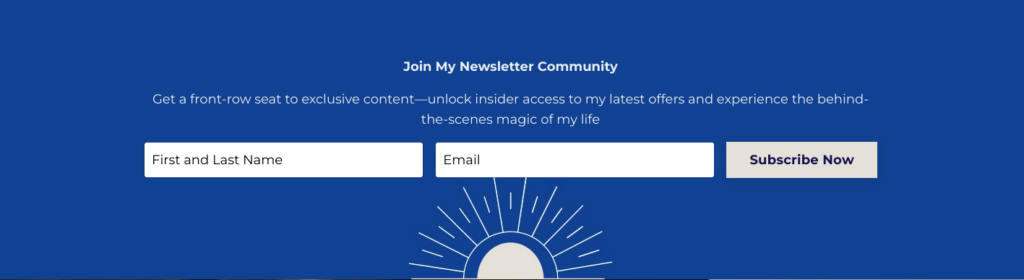
Sign up below to download your FREE Website Content Roadmap to get started!
Client Journey
When designing a life coach website it’s extremely important to keep your client’s journey in mind. I wanted to showcase all of the services she provides in a way that was clear and didn’t feel overwhelming to readers. I wanted to make it as easy as possible for users to navigate to the services they were interested in and easily find information on it. At the same time, some visitors may not know exactly what they need. In that case, I wanted to also introduce each service so potential clients can learn about them in order to invest in them.
We started off with determining what Kat’s goal was for her website. She had two main goals:
- Book free consultations
- Grow her email list
You will see throughout the website we have CTA’s (Call to action) for both.
Adding CTA’s to your website
Whether it’s a life coach website or any other industry or service, one thing in common will always be the importance of CTA’s throughout your website!
You will see that we have a button with a call to action on almost every section of the website. And that’s because we want to ensure the potential client isn’t left searching for what to do next at any point. Majority of these buttons will lead to booking a free consultation or signing up for a newsletter. Others will vary depending on where we want to lead the visitor on their client journey. For example if we have a section introducing Hypnotherapy we want a button that leads them to learn more about this service.
Let’s take a look at her website layout!
Top Navigation Menu / Header
We have the most important links in the Top Navigation. We have 7 different links added here that all lead to the most important pages on her website. I recommend having no more than 6 links in your Menu and a button. We didn’t add a button here so 7 links does not seem too crowded.
The reason we want to keep your top links to a minimum is because we don’t want to overwhelm your visitors. Someone might land on your website without knowing what action they want to take. In this case you want to make their journey as clear as possible. Only include the links in your menu that are necessary. Meaning what information does your client need in order to buy or book from you.
When designing a website for a life coach it is really important to have information on your packages, who you are, how to work with you and how to get in touch with you.
Think about what information your visitor needs in order to trust you and for you to answer any question they may have.
Because Kat has a few different ways of working with her we added a drop down to keep it super clean and organized.

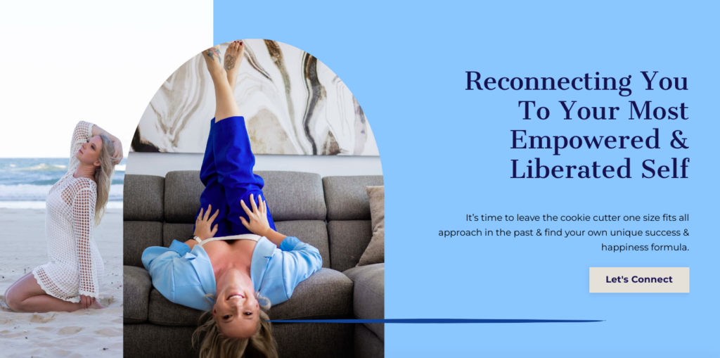
Above the fold
The next section I want to focus on is the above the fold section.
Above the fold is the very top section of your website page. This is the first thing a visitor sees when they land on a specific page. It’s super important to capture your potential clients’ attention here because these days my friend, the majority of us have short attention spans. It’s just the way it goes! We have approximately 7 seconds to capture their attention. And above the fold is where we are going to do that! This is basically everything you see on your screen before you start to scroll down the page.
You want to provide the following information here:
- What services you offer
- How you can help your ideal clients
- CTA (How they can work with you)
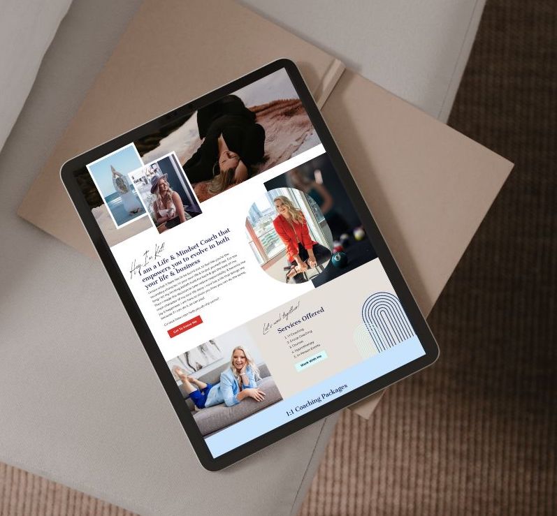
Homepage layout
Right below the “Top Banner” or above the fold section we have a form to sign up for her email newsletter. Remember one of her goals is to grow her email list. And as we discussed a minute ago, we only have about 7 seconds to capture someone’s attention. So we want them to take action as soon as possible! This is why having your email sign up closer to the top of the page is always a good idea!
About Kat and introduction to services
Then we introduce Kat to start to build trust with her potential clients. We want them to feel a connection with her. Choosing a life coach is a very personal experience and we want your users to really get to know you and your journey. This section has a CTA to read more about her journey which leads users to her About page.
Then we have listed out all of the services she offers so clients can quickly learn how they can work with her. Without overwhelming them with information.
You can see we have also added a lot of visuals to create interest and break up the copy!
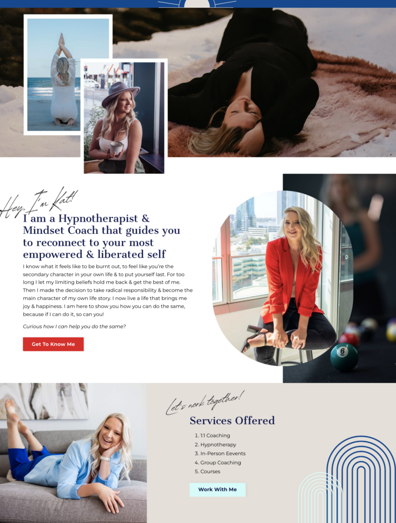
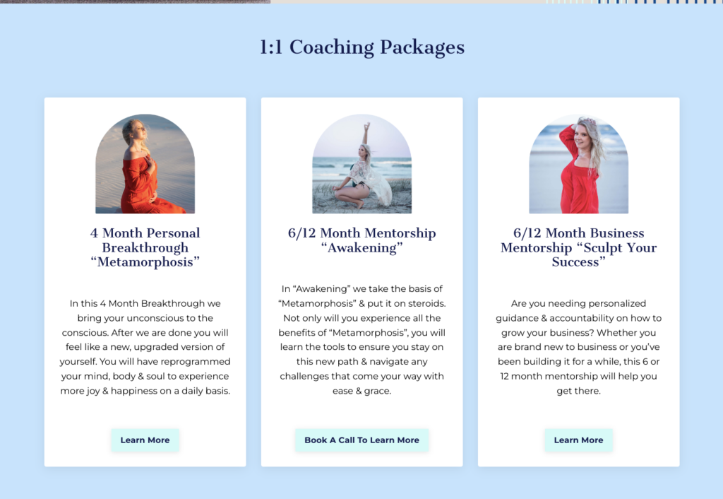
Book coaching packages
We wanted to put a focus on Kats’ 1:1 coaching packages as these are her biggest focus. Of course we provide a lot more information on her actual coaching pages. But we did want to share a snippet here to give the visitors a taste of what they can get when they work with her!
We have added two CTAs to guide visitors to the 1:1 Coaching page to learn more. We added one button to book a free call in the middle. This gives the user the opportunity to choose what they want to do next.
Introduction to services
Here we have an introduction section for each of the services she provides. This is a snippet of what they will learn on each corresponding page. It’s a good idea to have these short introductions on your Home page because it gives potential clients a quick brief on your different services.
You know the services you offer and what’s included. The clients you work with also know. But for someone brand new landing on your website, all of this might be very new to them. So we want them to be able to choose their own next step in their user journey. We want to give them the opportunity to find what service they connect to.
And we end it off with a client testimonial and the Footer!
You’ll also love…
The Mindful Approach to Website Navigation and User Experience
Website SEO for Holistic Entrepreneurs: Attracting Your Tribe Organically
Manifesting Success: Designing a Website for Your Dreams
Content Marketing as a Projector in Human Design
The Power of an Authentic Website in Attracting Your Ideal Clients
