


There are a lot of things that go into website design but website navigation and user experience have to be one of the most important!
If you are completely new to learning about website design then here’s a little introduction to these key players.

You know you need a website for your business but you have no idea where to start?
Don’t worry, I got you!
Sign up below to download your FREE Website Content Roadmap to get started!
Website Navigation
“Website navigation is the act of clicking and looking through resources on the internet, such as the various pages that make up a website.”
Quote from Indeed
You can think of website navigation as the actual clickable elements throughout your website. They take you from point A to point B. Whether that’s to another section on the same page, onto another page on your website or to another website altogether.
Let’s get a little deeper into what this looks like on your website...
Navigation Menu
Your navigation menu is built up of links to the most important pages on your website. The pages you know your users will want to visit or you want them to visit for more information. Here’s a great example!
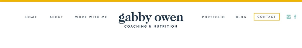
Image Source: Showit
The navigation menu should not have more than 6 links (including your button). This is because we want to keep your top navigation super clean and we don’t want to confuse your user. When you are building out your website, always think about your website goals. I recommend having 1 to 2 goals but you can have three if that’s something like sign up for your newsletter.
When you are deciding on which links to have in your navigation menu think about:
- What information does my visitor need to buy/enroll
- What information do you want them to know
What information does my visitor need to buy/enroll
This will vary for different industries. For example, if you are a life coach your visitor will want to know about you and your journey. They will want to know what you have been through and what qualifies you to teach them. What can they learn from you? Can they connect with you on a deeper level? Because of this you should have your About Page listed in your navigation menu.
Whereas if you are a Plumber then your visitors probably aren’t as interested in your journey to becoming a Plumber. They want to know how much you charge and can you help them fix the problem. Therefore you wouldn’t need your About Page on your top navigation. You could add an About Page if you’d like but I would recommend linking it in the Footer or you can have internal links within the website.
What information do you want them to know
There may be information about your services that your ideal clients are not even thinking about yet. For example, you’re a life coach and they came to your website to learn about your 1:1 coaching packages. But you also offer Group Coaching and Hypnotherapy but they had no idea. Having these key services in your top navigation can introduce visitors to them even if they didn’t come to your website looking for them.
Simple and concise titles
Don’t get too fancy or creative with your navigation titles. You want it to be very clear what each page is about. Anyone on your website should be able to read a title and know exactly what information they will get when they go to it. For example, Services will lead them to all of your services.
It’s okay if it feels like your navigation titles are similar to everyone else’s by keeping them basic. That’s what we want here, very clear and intentional titles. There’s a reason everyone is using About for their About Page.
Types of website navigation links
There are two types of links you have have throughout your websites
- Internal links
- External links
Internal links lead to pages or sections within your website.
External links lead to a page on another website. They lead visitors off of your website. There are many reasons to have external links in your website. For example, when you are writing a blog post and you link out to give credit to a source.
Pro tip: Remember to always select “open in new window” when linking out so you don’t lead visitors completely off of your site.
Make sure links are visible
It should be really easy for your users to navigate through your website. Which is why it’s really important to make sure your links are visible. Here are some ways you can make your links easy to find:
- Linked text should be a different color than the rest of the copy.
- Buttons
- Icons – like arrows
- Clickable images – add hover effects so users know clicking on the image will create an action. Eg. When a user hovers over an image it shows text that encourages them to “click here” “buy now” “read more” etc.
Step by step guide to creating image hover effects on Showit
Footer
Website footers are also an important place to include links. The Footer is similar to the Header (Navigation Menu) in that it includes internal links and your Footer will be at the bottom of every web page on your site (unless it’s a sales page). And we want to take advantage of this! I would encourage you to add all of your page links to your Footer. This is the perfect place to showcase all of the different pages you have on your website. If there’s anything you couldn’t add to your Navigation Menu you can add it here.
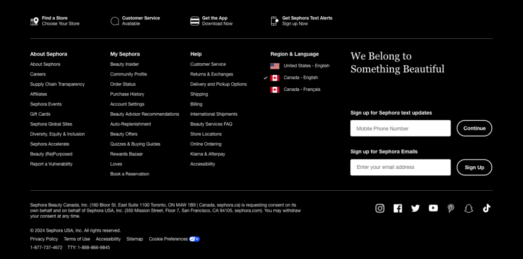
Just make sure you are keeping your Footer organized even if you do have a lot of links. Here’s a great example from the Sephora website.
Keep your most important links towards the top of the page
When a user is navigating throughout your web pages they won’t necessarily read the entire page! Or even scroll through the entire page. If you have specific links or actions you really want them to take, link them closer to the top of the page.
For example, if you want to grow your email list then have a form to sign up closer to the top vs. at the very bottom.
User Experience
“UX design, or user experience design, is the process of increasing a user’s level of satisfaction with a product or service by improving its functionality, ease of use and convenience.”
Quote from Hubspot
You can think about User Experience as the Google maps directions of your website. It’s how you lead your visitors to take action. When I am strategizing a website layout I always think about the journey we want to take your visitors on. If they start off on the homepage and you want them to go to your services page to book with you. What information can you provide that will make them want to learn more and take action to visit that page.
Each page of your website should be designed with your user journey in mind. You can do this by brainstorming and connecting links to other pages to visually see how users can move throughout your website.
Here are some ways you can get clear on how to determine your User Experience.
Get extremely clear on your ICA (Ideal Client Avatar)
It’s really important to know who your client is because we need to know how to speak to them, what visuals to show them and what copy is going to get them to take action. This is the strategy part of your website!
You want to be very intentional with the layout of your website because it’s going to determine the actions your visitor takes. This is why it’s so important to know exactly who you are speaking to. Get into the minds of your ideal clients, think like them and imagine working through your website with their frame of thought.
Market research
Market research is a great way to get to know your ICA. Learn about who they are and how you can truly help them. As small business owners we sometimes have ideas of what we want to do or offer. But that doesn’t necessarily mean that’s what our ideal clients want. And the only way to know what they want is by asking them!
Here are some ways you can do market research:
- Stories polls on IG
- Google questionnaire
- Get on a call
It’s good practice to provide an incentive in exchange for their time and to show appreciation. This is also a great way to share your services with your ideal clients. When I do market research as a Website Designer I offer a free website audit. This allows me to connect with my ideal clients who are taking their time to provide me with clarity. It’s a really great way to connect with your audience and get a one on one with them!
Visual design
“To have successful visual design, artistic design principles including balance, space, and contrast are crucial. Color, shape, size, and other elements also impact visual design.”
Quote from Hubspot
The design of your website is so much more important than just have a “pretty” website. Of course we all want a beautiful website that represents our brand. But when you are keeping User Experience in mind it’s taking it one step further. The placement of elements throughout your website can create a great user experience or leave them confused and not knowing what action they’re supposed to take.
The last thing you want when someone is on your website is them leaving as quickly as they got there. And this is quite possible if your website seems messy or has too much going on. Your website should incorporate your brand but also be very easy and simple to navigate.
There are certain design layouts that guide your eyes to move from one section to another. For example, the zigzag website layout which guides you from one element to another in a zig zag manner.
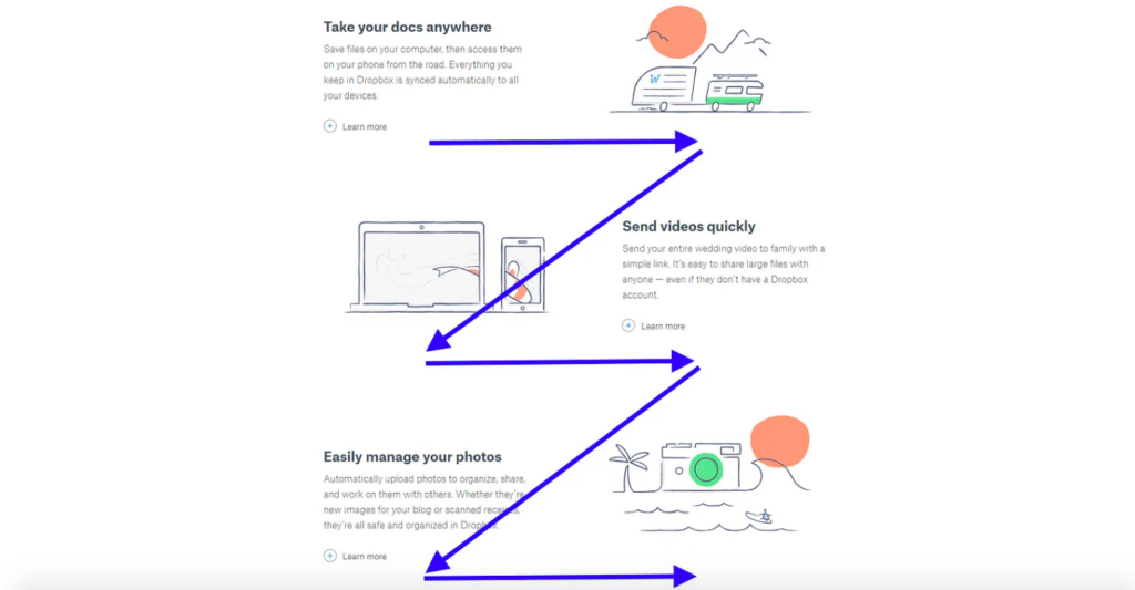
Image credit UX Planet
If you want to learn more about beginner website layout options visit this article by Wix. They have some really great examples there!
10 best website layout ideas to get you started
Break up your text with sizing and visuals
Break up your text with different sizes (headings) to make the copy digestible. Capture their attention with larger heading size fonts and if they are interested they will read more about that specific topic. Remember, we all have short attention spans these days. We don’t always read all of the text on a webpage. So you want to be really intentional with the information you are sharing, make it the most relevant and necessary.
Use visuals to break up the copy on your page. This makes it easier to read and a more pleasant experience for your user!
Your clients website journey
User Design or UX Design is using your website copy, images and design layout together to create flow through your website. You are combining these elements together to guide your user to find what they are looking for.
Understanding your ideal clients will help you determine what information you need on your website. Your website should provide answers to your visitors and help them solve their problems.
Always remember you are designing and writing for humans. Connect with your ideal clients on a deeper level, bring them into your world with your brand colors and images. It’s better to be simple and clear than try to overly complicate your website design to create something “unique”.
You will also love…
How To Add Your Font Style And Colors On Showit
How Does A Showit Blog Work With WordPress
Manifesting Success: Designing a Website for Your Dreams
Using the WordPress Yoast plugin for your Showit Blog
Website SEO for Holistic Entrepreneurs: Attracting Your Tribe Organically
