


Forever Photobooth Rental Studio website and brand refresh
My client Samantha had an existing DIY website on Squarespace. But she was ready to have a brand new look to the online presence of her business! The website she had designed on Squarespace was good but it didn’t bring excitement to her brand. She wanted a website that brought in the feeling of high-end luxury but also had a splash of fun!
For her website, she chose to invest in a Semi-Custom Website Package. This is when you choose a template from my shop and I update it with your branding and content. Because it’s still semi-custom, I do change up the layout a bit so that it does not look the exact same as others who may have started with the same template.
Sam picked the Rose Template
Branding is not included in my semi-custom projects so she actually DIYed her branding. And she did an amazing job! The colors and fonts she picked worked so well together and really brought in that high-end feel she was looking for. She had an existing logo from before which we kept the same!

You know you need a website for your business but you have no idea where to start?
Don’t worry, I got you!
Sign up below to download your FREE Website Content Roadmap to get started!
Website goal
The first thing we want to look at when thinking about website strategy are the client goals. What does the client want to achieve with this website? Does the client want to provide information? Do they want their clients to be able to easily book online? Do they want their website visitors to sign up for their email list?
Sam’s goal for her website was to clearly showcase their photo booths and to book clients.
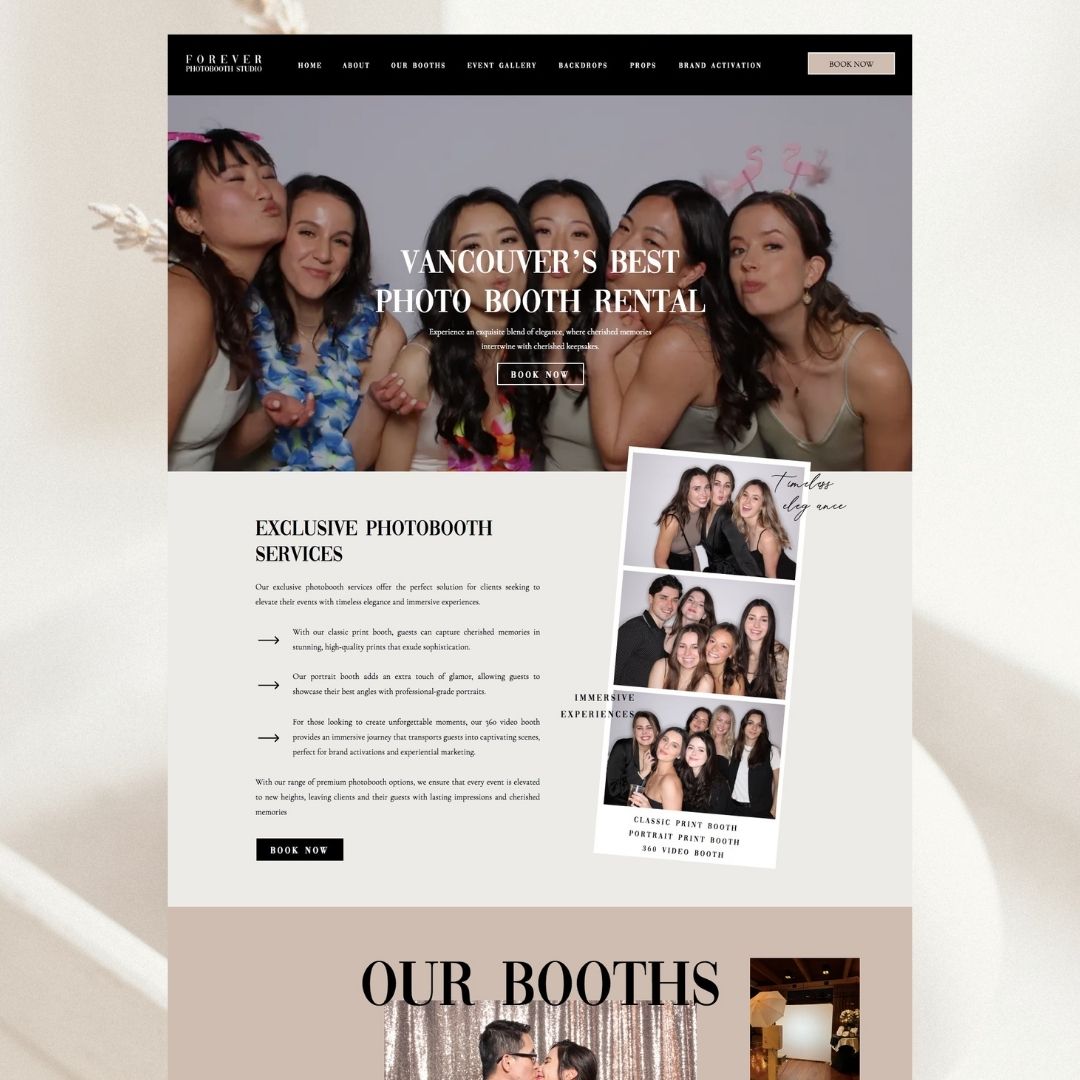
Homepage above the fold
Top navigation menu
The top navigation, menu or header (whatever you decide to call it) is prime real estate on your website. It’s at the very top, this is where your users will turn to find the information they are looking for. The other thing that makes it so important is that it’s on all of the pages on your website.
You might see some sales pages without a menu but the majority of web pages on a website will have a menu.
You want to select the most important pages to link here. And you also want to think about the order you are placing these links in. For the Forever Photobooth Rental website we chose links that directly share more information about their services. The pages we chose on their menu are:
- Home
- About
- Our Booths (with a drop down for each booth type)
- Event Gallery
- Backdrops
- Props
- Brand Activation
- Book Now
Each of these pages provide information about their services. We have the Book Now link on a button to make it nice and bold so that it sounds out and makes it super easy to book!
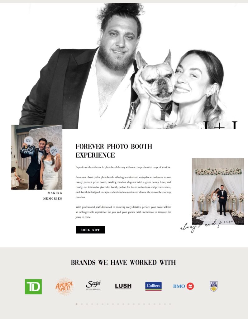
Above the fold
Reference image above
The above the fold section on a web page is the section you see before you start to scroll down. It’s the first thing users will see when they land on a specific page. This is really important because this is where we want to capture the users attention. You may have heard this stat already but you have approx 7 seconds for a user to determine whether they are interested in your content or not. This is why we want to captivate them immediately!
You want to share images on the above the fold section that are captivating to capture the user’s attention. You also want to share a bit about the information they will find on this page. This is your tagline. I love the tagline Sam chose because it declares they are the best in the City and who doesn’t want to hire the best!?
Forever Photobooth Studio tagline
Title: Vancouver’s Best Photo booth Rental
This is big, bold and in your face. You can’t miss it!
Paragraph: Experience an exquisite blend of elegance, where cherished memories intertwine with cherished keepsakes.
She shares a bit about the client experience here, their services and what sets them apart. She talks about “cherished memories and keepsakes”. It tells the website visitor what they will get when they hire Forever Photobooth Rental Studio. It’s a perfect way to connect with your user, making them want to learn more.
CTA: Book Now
Then we have a call to action to Book Now on a button. Again, making it super clear how you can hire them.
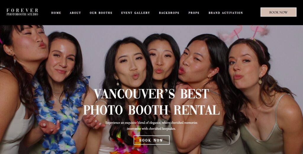
Homepage design layout
Introduction
Right below the above the fold section we have an introduction to their business. Here we are sharing a little more about their business, what sets their photo booth company apart from others. And we mention what types of photo booths they offer.
I designed a strip of images that overlaps the section above. This plays into their business but also adds a fun element to the website.
It was really important to my client that we have a lot of images throughout the website. Images help break up the copy on your site but it’s also exactly what their business offers. So we really wanted to showcase their work throughout the site.
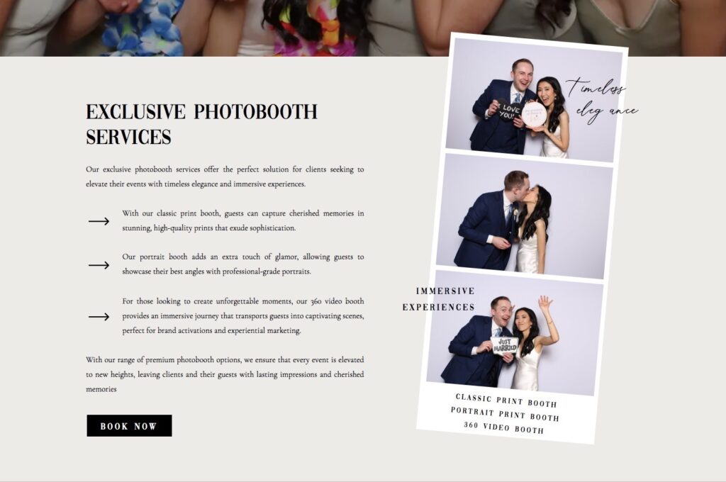
Photobooth rental options
We added a fun little collage of images here. You can see spacing between the images to keep the section nice and clean to go along with the high-end feel. The collage goes with the theme of their business. We used this section as an introduction to the types of photo booths they offer. You can see the title “Our Booths” big and bold here. Again, tying in some of the fun aspect to their business but also staying on trend with big and bold letters.
Right below that you can see each booth has it’s own introduction. On the homepage we want to share a little bit about each service. This is a good idea because some people may come to your website not knowing what you offer. Or what service would be best for them.
With these mini introductions to each Photobooth rental option the visitor can easily determine which one will best suit their needs. And then they can easily learn more by selecting the buttons next to each that very clearly states “Learn More”.
We also incorporated images next to each that go along with that specific type of booth.
Forever Photobooth Rental Studio Experience
We have shared a lot of information up to this point so I decided to break it up with a large image background. The Image you see here is set to window height on their website so it covers the entire screen. This is a great way to showcase their work and kind of start a new section on their website. This image is also set to fixed which means there’s a nice transition where the section below it overlaps on this image as you continue to scroll down the page.
Then we have a section that shares a little bit more about their company. We talk about what the experience is like when you hire Forever Photobooth Studio. A little more about their services and staff. And then of course a CTA to Book Now.
Always remember that your website visitors are not going to read every word on your website. So while some things may seem repetitive, you never know exactly what information your client might read. That’s why I like adding this little intro to their company here because your visitor might not have been as interested when they first landed on your website. But maybe after learning about your different types of photo booths they will want to learn more about the company itself.
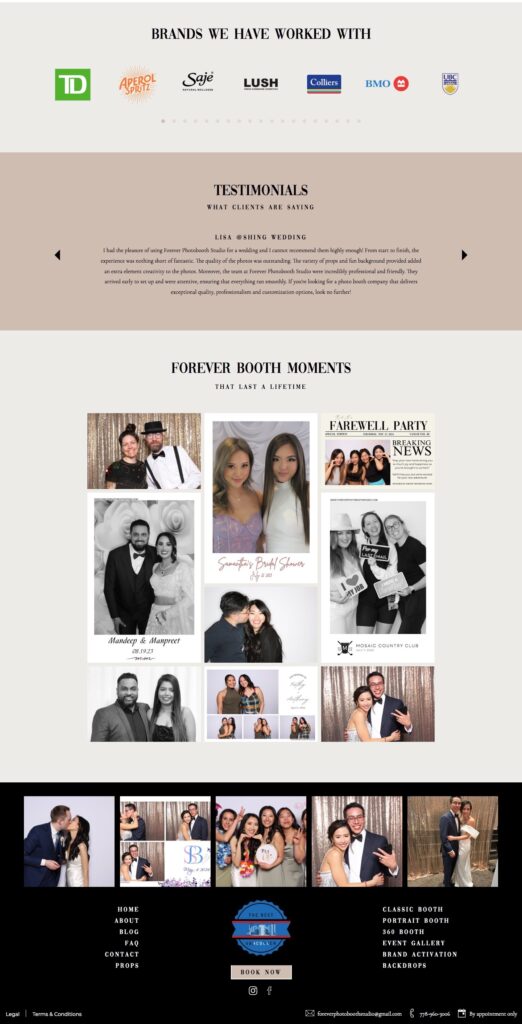
Sharing client love
You can see here we have added a strip of logos. These are brands that my client has worked with. If you do have logos that you can add to your website it helps build credibility and trust!
Right below that we have a client testimonial slider.
And then we have an image gallery which ties it all together by showcasing their work once again. Because their business is all about images, we really wanted to share as many as we could throughout the website.
Footer
Here we have pulled their instagram feed into the footer. So as they update their instagram posts, they will automatically update on their website. This is a great way to keep your website active and up to date.
We have every page on their website linked here as well. We had to pick the most important links for the top menu however for the footer we can add all of the links. Since the footer is on all pages as well, it’s a helpful place for users to go to when they are trying to find something on your website.
We added an award they received in the center. This award actually has a hover effect so when the user hovers over the award it will transition into their logo.
And of course right there in the center we have a button to book now!
You’ll also love…
Custom Life Coach Website Case Study
How to Optimize your Website SEO in 2024
How to add Instagram Feed to Showit Website
The Mindful Approach to Website Navigation and User Experience
