


I’m going to go ahead and make this claim: your website banner is arguably the most important section of your website! Each page on your site will have its own hero section (banner) but the Homepage banner is especially important because this is most likely the first thing visitors will see!
If you’re designing your website and wondering how to structure this top section of your homepage, these bold website banner layout ideas can help you create a clean, professional first impression (which will make it sound out for your ideal customers!).
A website banner (often called a hero banner or hero section) is the large section at the top of a webpage that introduces your brand, communicates your main message, and guides visitors toward their next step.
The layout you choose determines:
- Where your headline appears
- How images or videos are displayed
- How your visitors decide if your content is right for them
Strong website banner design ideas help visitors understand your website within seconds. This is so important because if they’re in the right place and continue to spend time on your site, it really helps your SEO! And of course, you’re building trust and connection (possibly selling) to this new visitor!
If you’re a solopreneur building your own website, thoughtful banner design for websites can immediately elevate your brand.
P.S. If you’d rather skip the design guesswork, I offer SEO and Website Design Services where I custom design your website to help you intentionally grow your business by attracting the right clients! Book a free consultation, I would love to design your website for you!
Download Your FREE Cheat Sheet
The Plug-and-Play Blog Writing Prompts That Took My Traffic from 3K to 50K Impressions
This free cheat sheet will help grow your reach and visibility faster with AI prompts that will help you write each blog post faster and optimize it for SEO (Search Engine Optimization – think Google) and AEO (Answer Engine Optimization – think AI Search).
TL;DR: 5 Website Banner Layout Ideas
If you’re looking for simple banner layout ideas for websites, these five layouts work beautifully on almost any site:
- Full image background with text overlay
- Image slideshow banner with text overlay
- Split screen banner (text on one side, image on the other)
- Video background banner with text overlay
- Image collage banner with centered text
Each of these website banner ideas organizes text and visuals differently, which creates a unique style and browsing experience for visitors.
What Is a Website Banner?
A website banner is the top section of a webpage that introduces your brand and communicates your main message. Each page on your website has a banner that tells your website visitor exactly what content they will find on this specific page.
Most website hero banner design sections include a:
- Headline
- Short supporting sentence
- CTA (call-to-action) button
- Visual element such as an image, video, or graphic
This area is often called the hero section, and it’s one of the most important parts of each web page because it shapes the first impression visitors get when they land on your site.
Clear banner design layout helps visitors quickly understand:
- What you do
- Who you serve
- How they can work with you
5 Website Banner Layout Ideas You Can Use
Below are five different website banner layout ideas that you can use as inspiration for your own website. It’s nice to switch things up so each page doesn’t look exactly the same or to make your website stand out from competitors!
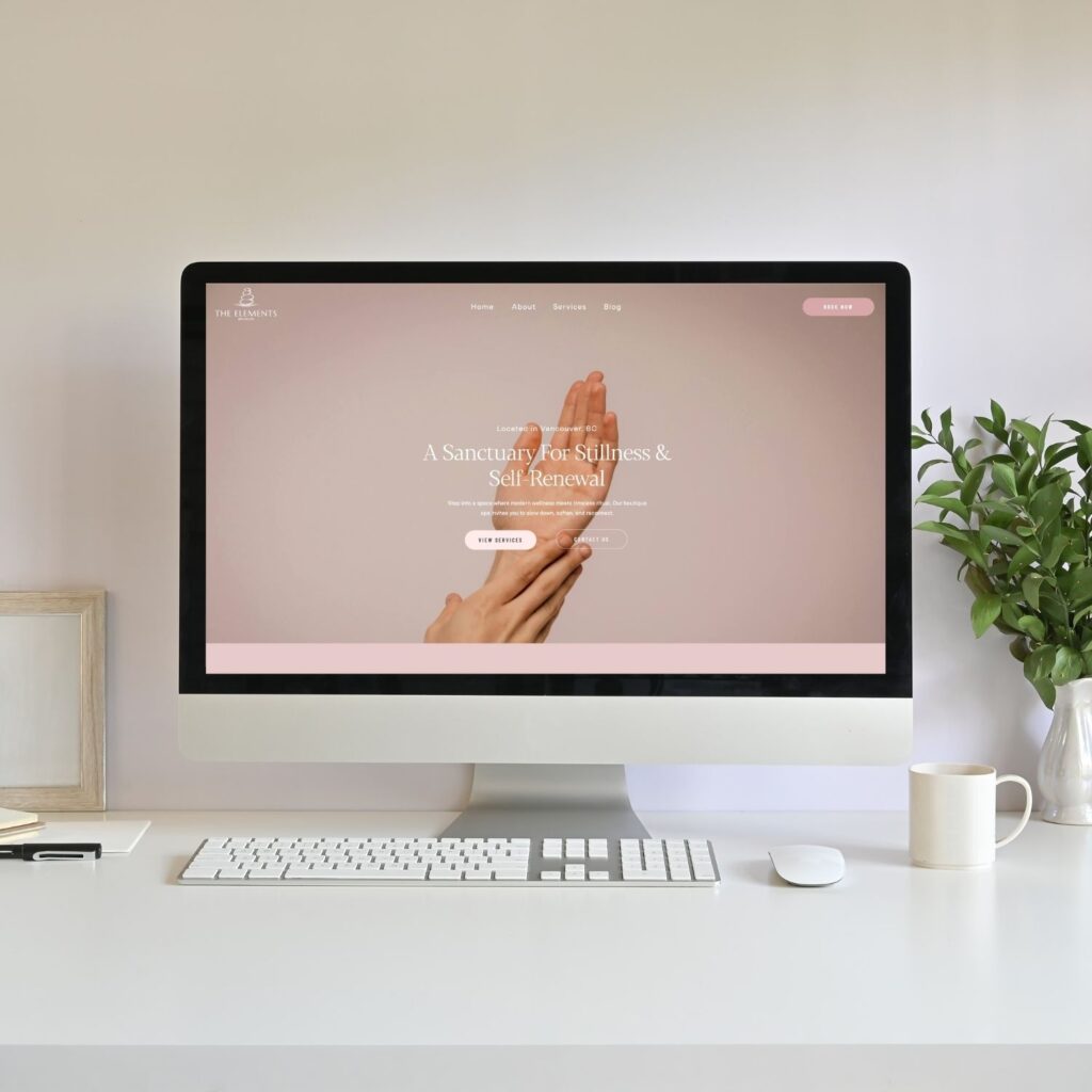
1. Full Image Background With Text Overlay
This layout uses one full-width background image that fills the entire banner area, with text placed on top of the image.
Layout structure:
Background:
- one full-width image
Foreground
- Title
- Heading
- Short Paragraph (optional)
- CTA button
Options for text placement:
You can personalize this banner design layout by choosing where you place your text. Here are some options:
- Centered
- Bottom left
- Bottom center
- Top left
You get the idea! Play around here and personalize where your text looks best when placed on top of the image you chose.
Why this layout works:
This is one of the most popular website banner design ideas because it’s simple, clean, and visually impactful.
It works well for:
- Service-based businesses
- Coaches
- Personal brands
- Lifestyle businesses
Here’s an example of a custom website for my client: Eglantine Fournier

Here’s another example from my Showit Rosewood Template design
2. Image Slideshow Banner With Text Overlay
This layout is similar to the previous one, but instead of a single image, the background rotates through multiple images like a slideshow.
The headline and text stay in place while the visuals change.
Layout structure:
Background
- Rotating image slideshow
Foreground
- Title
- Heading
- Short Paragraph (optional)
- CTA button
Why this layout works:
This creative banner design idea is useful when you want to showcase multiple visuals without cluttering the banner.
It’s commonly used for:
- Photographers
- Event businesses
- Portfolio websites
- Product brands
This approach adds visual variety while keeping a clean banner design for websites.
Here’s an example from my client website: Charming Petite Events
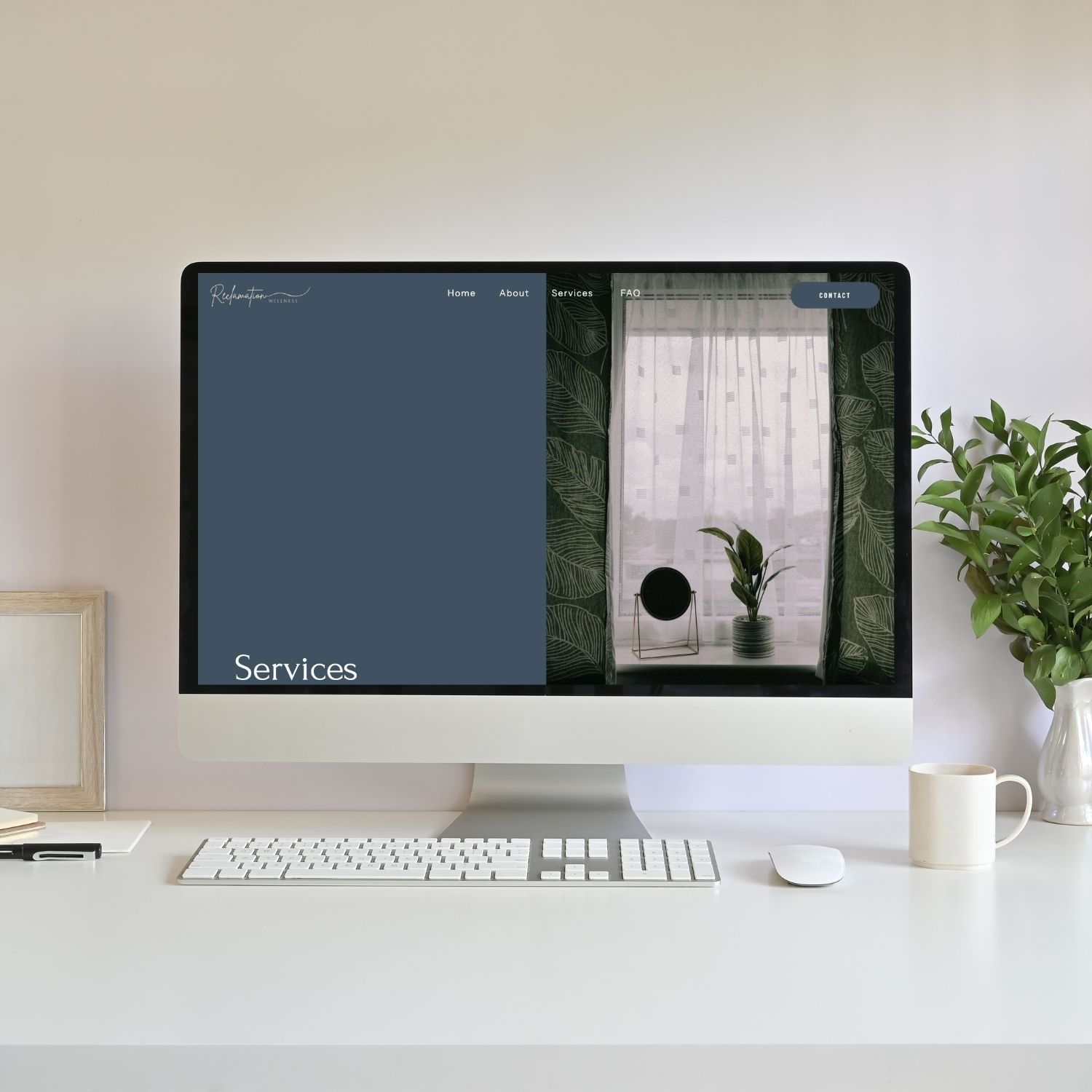
3. Split Screen Banner (Text + Image)
This layout divides the banner into two sections.
One side has an image and the other side is where you add your text.
Layout structure:
Left side
- Title
- Heading
- Short Paragraph (optional)
- CTA button
Right side
- Image/graphic/video
You can also flip the layout so the image appears on the left and text on the right. If you have an image of yourself or someone looking in one direction, I recommend making it look like you are looking towards the text. So whichever side that places your image on! It directs the users eyes towards your copy.
Why this layout works:
This is one of the most common modern website banner design styles because it balances visuals with easy-to-read text. You don’t have to fight over trying to find an image or video where you can still read the text on top of it.
It’s a popular option for:
- Honestly, all industries and businesses
I actually love using this style on the additional pages on your website. For example, using options 1 or 2 on the Homepage and using this option to switch up your style for your About page, etc.
Here’s an example from my client website: Sharon Dial

4. Video Background Banner With Text Overlay
Instead of a static image, this layout uses a short looping video behind the text. It’s honestly so eye capturing and I’m still obsessed with the example from my client below!
Layout structure
Background
- Autoplay looping video
Foreground
- Title
- Heading
- Short Paragraph (optional)
- CTA button
Videos often show subtle motion such as:
- Nature scenes
- People working
- Product close-ups
- Lifestyle footage
It’s super important to keep your video very minimalistic. You do want it to be eye catching but if you have overlapping text, you don’t want to make it too hard to read on top of the video.
Why this layout works:
Video banners create strong banner design inspiration because movement naturally captures attention.
They work well for:
- Travel brands
- Creative studios
- Wellness businesses
- Lifestyle brands
Pro tip: Make sure your video is optimized so it doesn’t slow down your site!
Here’s an example from my client website: Hope Gaston
5. Image Collage Banner With Centered Text
This layout uses multiple images arranged creatively rather than a single background image.
Your text can be in the centre or on a side, really depends on what looks good with the layout of images you’ve designed. This has been a really on-trend style lately!
Layout structure:
Background
- Several images in different sizes
- Arranged in a grid or collage style
Foreground
- Title
- Heading
- Short Paragraph (optional)
- CTA button
Why this layout works:
This is one of the most visually interesting creative banner design ideas because it allows you to showcase multiple visuals at once.
It works especially well for:
- Photographers
- Designers
- Product brands
- Creative portfolios
This style creates a more editorial-style homepage banner idea.
Here’s an example from my own website!

How to Choose the Right Website Banner Layout
If you’re exploring different hero section layout ideas, the best layout depends on your content and brand style.
Full image banner is right for you if:
- Have strong photography
- Want a visually immersive homepage
- Or you have a short headline
Slideshow banner is right for you if:
- Want to show multiple visuals
- Have portfolio images or products
Split screen layout is right for you if:
- You want to add more text to explain your services, business, etc.
- Readability is your top priority
Video banner is right for you if:
- Want motion and storytelling
- Your brand relies heavily on visuals
Collage banner is right for you if:
- Want a creative or unique layout
- Have several images to showcase
Website Banner Design Checklist
Once you choose one of the website banner layout ideas, use this checklist to make sure your banner is working effectively. AKA working to keep your visitors interested and on your website!
A strong banner design for websites should include:
- Clear headline explaining what your business does
- Short supporting sentence
- CTA (call-to-action) button
- High-quality image or video
- Enough contrast for readability
- Clean spacing and alignment
- Mobile-friendly layout
Following these banner design tips will help your banner feel clean and professional.
Common Website Banner Design Mistakes
Even good website banner design ideas can fall flat if a few common mistakes happen.
Too much text
Your banner should introduce your website; not explain everything.
Most banner design layout structures include:
- Title
- Heading
- Short Paragraph (optional)
- CTA button
Low contrast text
If text blends into the background image or video, visitors will struggle to read it! Make sure your text is still readable!
No call-to-action
A banner without a CTA leaves visitors unsure what to do next. Strong hero section design ideas always guide the visitor toward the next step. Never leave your visitor guessing!
Slow-loading visuals
Large images or videos can slow down your site and hurt user experience (and SEO). Be sure to optimize both before uploading onto your website!
Frequently Asked Questions
What should a website banner include?
A banner should include a headline, short supporting text, a call-to-action button, and a visual element such as an image or video.
What is a hero banner on a website?
A hero banner is the large top section of a webpage that introduces the main message of that specific page. Unless it’s the Homepage hero banner, in which case you are introducing your business/services as a whole.
What makes a good website banner design?
Good website banner design is clear, visually balanced, and easy to read.
What is the difference between a banner and a hero section?
A banner refers to the visual area, while the hero section includes the full structure of messaging, visuals, and calls to action. In web design, we often refer to them interchangeably as they technically live on the same section.
How do you make a banner look professional?
Use high-quality visuals, readable typography, proper spacing, and minimal text.
Should a website banner have a call to action?
Yes. A CTA helps guide visitors toward the next step and improves your conversion rate!
How much text should be in a website banner?
Most banners should include one headline and one short supporting sentence and a CTA (call-to-action).
TL;DR Recap
If you’re exploring website banner layout ideas, these five layouts are simple and effective:
- Full image background banner
- Image slideshow banner
- Split screen banner
- Video background banner
- Image collage banner
Each of these banner layout ideas for websites organizes visuals and text differently, allowing you to create a banner that fits your brand and message.
If you’d like a website that combines beautiful design with SEO strategy, I offer custom website design services for solopreneurs. Book your free consultation to get started or learn more here:
You’ll also love…
How to Make a Moodboard for Your Brand (Why It Matters + What to Include)
Your Blog Is the Engine, Your Email Is the Invitation: A Simple Writing System
How to Identify Font on a Website (Tools Designers Actually Use)
Personal Branding for Solopreneurs: A Simple 5 Step System That Grows With You
How to Learn Graphic Design Using Canva: A Web Designer’s Branding Workflow
Liked this post? Pin it to Pinterest! 👇


