


Building a website can feel overwhelming! I mean, how are you supposed to know which elements you need on your website homepage?
I have had conversations with clients about the content they need to gather and the copy they need for their website and needless to say, they do feel a little overwhelmed at first.
But I promise you, once we break it down, it’s not that bad! You know your business, you know what information your clients need – it’s just about sitting down and doing the work!
The very first time I ever made a website for my first business (prior to becoming a website designer) I really had no idea what I needed to put on my website!
I felt so lost and kind of just wrote random stuff in random places to take up space. And to be honest, I do feel like business owners sometimes do this if they don’t have a clear direction on how to set up a strategic website.
And that’s just the most important part – you want to have a strategic website!
You want a website that converts your visitors into buyers/community members/someone who trusts you!
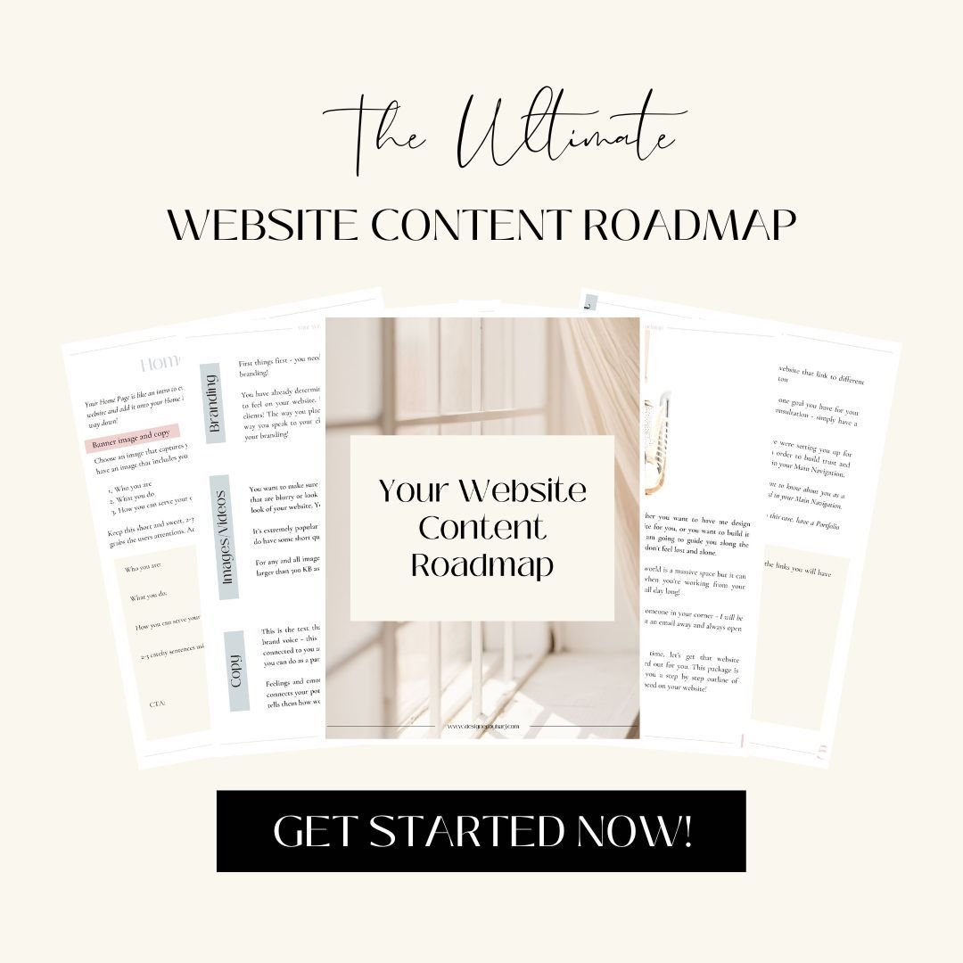
I do have a free Website Content Roadmap you can download and use to help guide you through building your website strategically. You can grab that here!
For today, we are going to focus on your website homepage content
This is important because this is most likely where your visitors are going to land when they first visit your website, unless they click on a specific link to a page.
And you only have 7-10 seconds, that’s right just 7-10 seconds, to capture your visitors attention.
So we know, we have to make that home page work for us, and make it work for us fast!

Here are 8 elements you need on your website homepage!
-
Top Navigation/Main Navigation
Let’s start with the very top of your homepage, and this is going to be your main navigation!
This navigation will be at the top of every single page on your website which makes it that much more important (unless you have a link to a sales page which does not require a main navigation).
This is going to be where your visitors will first look for guidance and direction on what to do next. Which is why the links you choose to have on your top nav are so important!
I have talked about this many times, you want to be very strategic with the links you choose to have on your top navigation.
I recommend having no more than 5-6 links and one button.
Your button is going to be the most important CTA for you.
Think about the most important action you want your website visitor to take. If you really want your visitor to schedule an appointment, that’s the main goal of your website, then simply write “Schedule an Appointment” on your button.
For the rest of the links, think about what information your visitor needs in order to convert them into paying clients.
For example:
-
If you are an online business coach then your ideal client will want to know about you as a person and your journey.
This means that having an About page would be necessary and something your client will be actively looking for – put this in your top navigation.
-
If you are a Hairstylist then your client would want to see your previous work – put a Portfolio link on your top navigation.
You also want to have your logo on your Top Navigation to build brand awareness!
2. The Hero Image
All images on your website need to be high quality!
The one thing that can completely make or break your website, regardless of how beautifully it’s designed, are the images you choose!
You do not want to have anything blurry or stretched out. Remember we are building customer loyalty with your website and the images are everything as websites are a visual asset.
The “hero image” is the image you choose for the very top of the page, right underneath the top navigation bar.
This one is super important because like I had mentioned earlier, you only have 7-10 seconds to capture the users attention, and that usually means you need to entice then with the content above the fold.
Above the fold is the area at the very top of every page on your website. It’s basically everything you see before you start to scroll down the page.
The hero image needs to represent your brand and business so your visitors can immediately connect with you.
-
If you have a personal brand, this is including coaches or any other lifestyle business, then you need a picture of yourself. You need to connect with your audience here.
-
If you have a brick and mortar business then you can have an image of your physical business.
-
If you provide a hands-on service, you can have an image of the service you create.
Think about what really represents your business and that’s the image you want here.
3. Tagline
You have captured the users attention with your hero image and now you want to offer a brief description that connects with your ideal client.
Your tagline should include:
-
Who you are
-
What you do
-
Who you serve
Answer these questions and put them into 2-3 clever witted sentences!
Use your brand voice here and again, capture your users attention.
Make them feel like you are talking directly to them and that you are the one who is going to help them solve their problem!
4. CTA – Call to Action
You have just told your visitor who you are and how you can help them with your tagline, now you want to nail down that conversion by having them take action.
And the best way to do this is to tell them exactly what to do.
Be very direct with your CTA’s
Don’t just write “Let’s do this!”. Because really, what exactly are they doing?
Yes, you want your CTA’s to be catchy and clever, but you also want them to be super direct!
So instead of “let’s do this!” write something like “Book a Call”. This way they know exactly what they’re doing when they click that button!
Right now we were just talking about the CTA right below the tagline. But remember to have CTA’s throughout your website!
Best practice is to have one CTA always showing on the page so that the visitor does not have to search for what to do at any point. There is always an action available for them to take!
Here is a great example of a high converting Above the Fold section on a website homepage. This section includes the 4 elements we just chatted about!
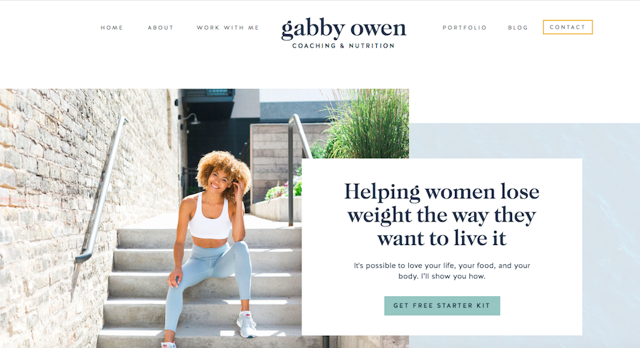
Image source
https://store.showit.co/designs/the-gabby/
5. Value Proposition
This is a statement that describes how you are different from other businesses in your industry.
-
This could be how you do things differently
-
your unique offers
-
anything that is going to set you apart
This statement should help your clients understand why they would choose you over someone else.
If we go back to our hairstylist example you could mention that you only use vegan products at your salon. This will really help to narrow down if you are the right person for the visitor.
You also want to include the value you add through your services or your products. What are you offering to your clients and your community through your business?
You can start to narrow this down by answering the following questions:
-
What are the benefits of working with you/using your products?
-
What pain points are your solving for your ideal client, and how?
-
What can they expect to walk away with after working with you?
Use your answers from these questions to put together 4-5 sentences that connect directly with your ideal client using your brand voice
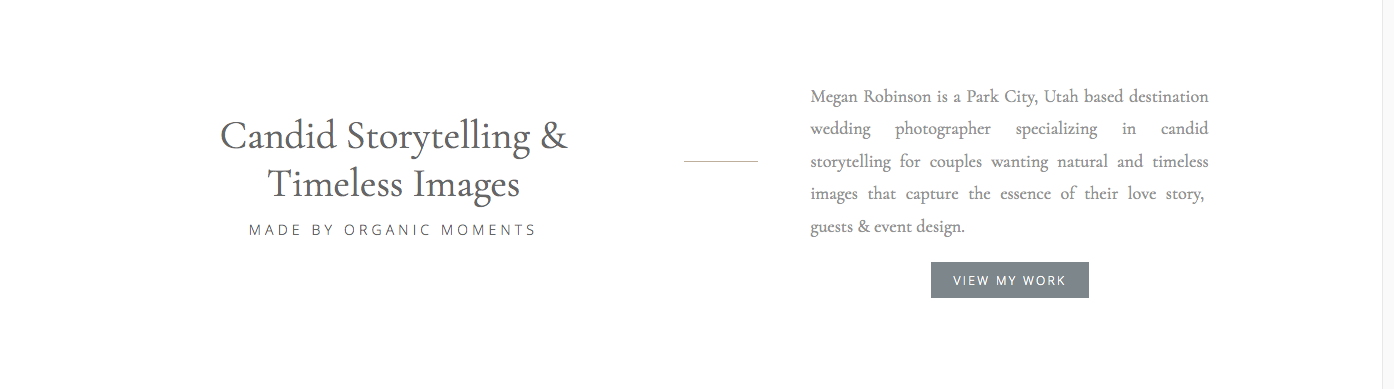
Image source
https://meganrobinsonphoto.com/
6. Introduction to Each Page
Your homepage should provide an introduction to the most important pages on your website!
Look back at the links you chose for your top navigation and use these as a guide. Take a snippet from each of these pages and create a section on your homepage dedicated to introducing that particular page.
For example:
-
For your About page take a snippet from your about page that really shares who you are and use that copy as an introduction on your homepage.
Pair this copy with an image of yourself
Then add a CTA to guide your client to visit the About page to learn more about you!
You are basically using these sections as introductions to each of the most important pages on your website.
Think again about what information your client needs in order to build trust and buy from you. Use these introductions to guide them to the page they may be searching for in order to learn more!
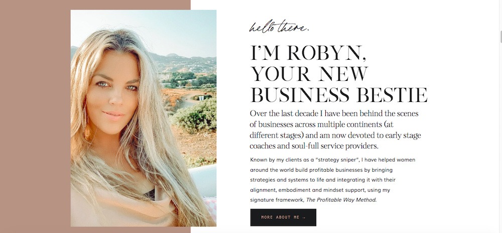
Image source
https://robyngooding.com/
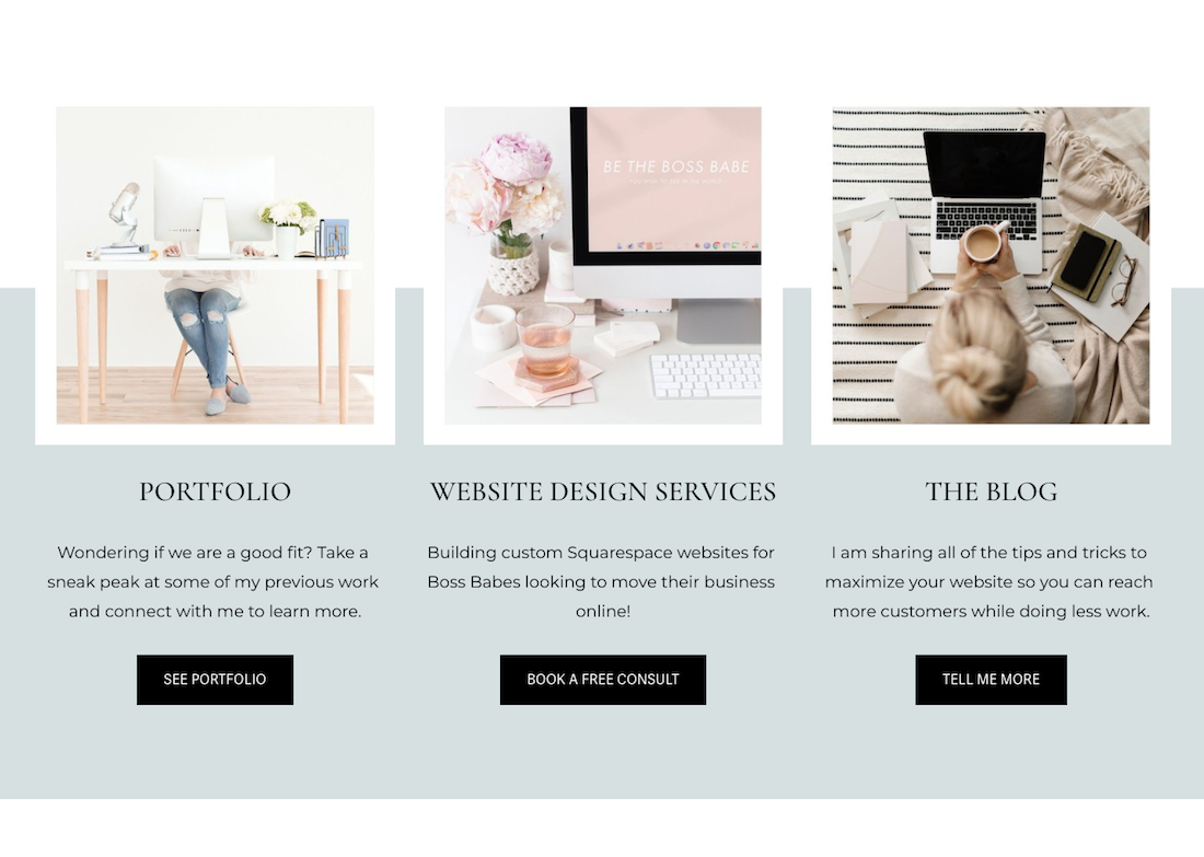
Image source
www.designedbyharj.com
7. Social Proof
It’s really important to build trust with your website visitors. And the best way to build trust? Is to hear from someone who has worked with you!
If you have testimonials then sprinkle them throughout your website homepage!
If you do not have too much content on your homepage when you’re starting off, just one testimonial is fine. But if you do have a very long homepage then you can add a couple more throughout the page.
8. Opt-in Offer
This one is unique to business owners who are actively growing their email list. If you aren’t growing an email list yet then you do not need to worry about this. However, I would recommend starting when you can! Having an email list is a huge asset for your business!
Connect a form to sign up for your freebie on your website homepage.
I also recommend having a form to opt-in on your footer as well so that it follows the visitor along to each page!
The more times you can mention your freebie the better. Add it as a pop-up, on your announcement bar and throughout pages.

Posts you will also love…
Showit Pricing – Which Plan Is Best For You!
