

How to Edit Squarespace Header
The Squarespace Header on your website is one of the most important pieces of real estate on your site!
This is where you list out the most important links that are the most relevant to your clients to make it super easy for them to find what they are looking for.
You edit these links in your website “Header” settings on Squarespace
On your Top Navigation you want to add 5-6 links max! And I always recommend adding a button for your main CTA to really help direct your client to take the action you want them to take.
I have a post on how to add a button to your website if you want to learn how to do that here. I also get into what to think about when determining which links make the cut for the top navigation. So if you have been curious about that, give this blog a read!

Today I am going to show you how to edit your site header on Squarespace
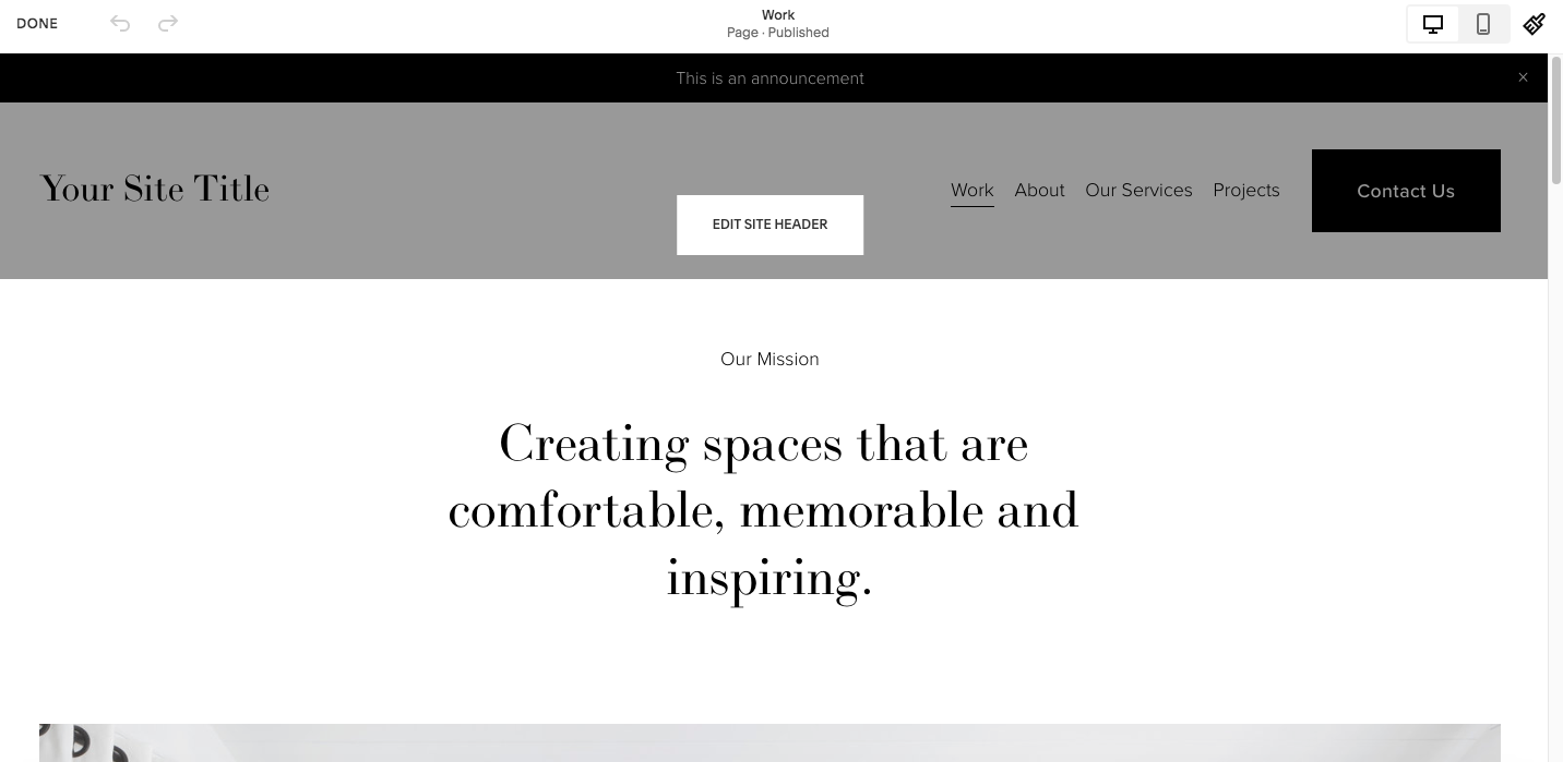
First you want to log into the back end of your website and then click “Edit” on the top left, as always, when we are getting started with website edits.
And then when you hover your cursor over the top of your website the “Edit Site Header” option will pop up, as you can see in the image below.
Once you select Edit Site Header you will see the editing options pop up on the left
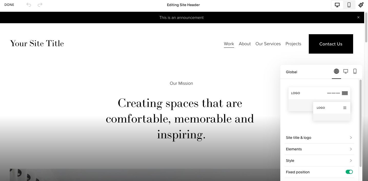
As you can see, you have three different editing menus on the top right. You have the Global editing option, Desktop and Mobile options.
We are going to start with the Global menu editing options
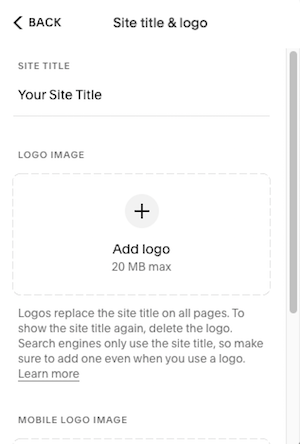
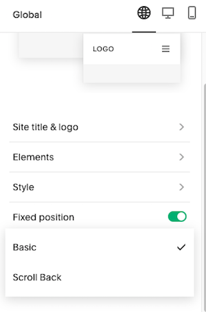
Select Site Title & Logo to update your website title
This is very important for SEO so make sure you use keywords here!
You can also upload your logo so that it shows up on your main navigation. You have the option to upload a separate logo for your mobile site if you choose to, if you do not upload anything there then your mobile site will use the same logo as your desktop version.
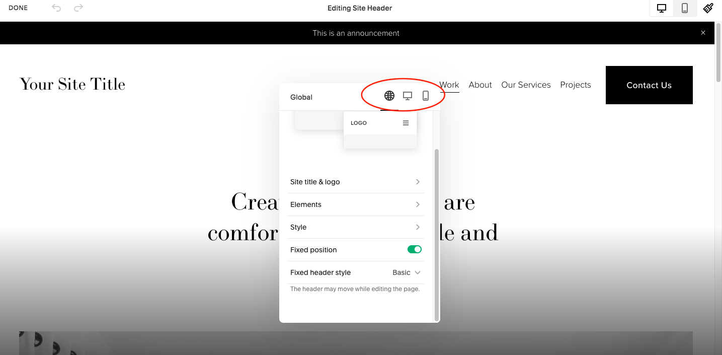
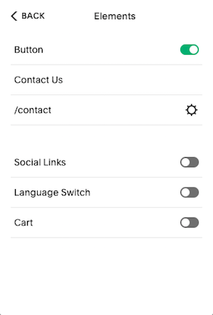
Select Elements to toggle on or off buttons, social links, language switch or cart
To learn more about adding and editing buttons on your main navigation on Squarespace I have an in depth blog post you can read here
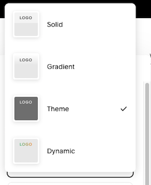
Select Style to change, just that, the style of the header
-
Solid will give you one a solid colored background
-
Gradient will use the background image of your first section right below the header and gradually fade it out at the top
-
Theme will allow you to select from your pre determined color schemes
-
Dynamic will also use the background image from your first section but it will not fade out towards the top
You can toggle on or off fixed position
This will allow you to create a “sticky” navigation that stays on the screen as the viewer scrolls down the page.
If you select basic the header will always show at the top if you select scroll back the header will not show when the viewer is scrolling down but will appear when the viewer starts to scroll up the page.
Now let’s look at the editing options in the desktop menu
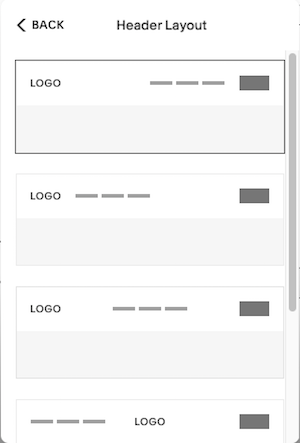
Select Header Layout to change the arrangement of the menu links, button and logo on your top navigation.
You have quite a few options here so feel free to play around until you find the one you love!
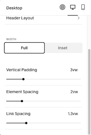
Full or Inset options
You can select whether you want the header to take up the entire width of the page or fit within the page by selecting either full or inset
Vertical Padding, Element Spacing and Link Spacing
You can also take it a step further and play with the vertical padding, element spacing, and link spacing to really personalize the navigation to fit your brand style
-
Vertical padding – use this to add or reduce space above or below the elements on your navigation
-
Element spacing – this will add or reduce space between the elements you have added and your links
-
Link spacing – this will add or reduce space between the links
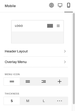
Now to edit the mobile version of your header on Squarespace
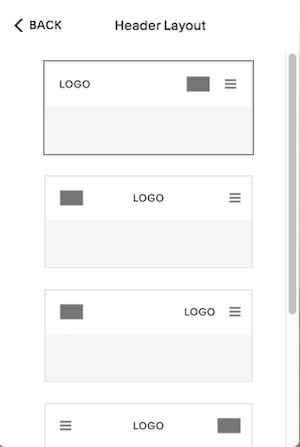
Select Header Layout the same as you did in desktop
Except now you have different styles to select from that are unique to the mobile view.
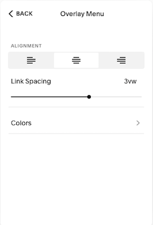
Select Overlay Menu to edit the menu that pops up when the viewer selects the navigation menu to open up.
-
Here you can choose whether you want the links left justified, centered, or right justified.
-
You can also select a color from your color schemes
 Posts you will also love…